TL;DR — Creating a role for the website as the hub of a multi-channel CX strategy
Work completed while working at CDS, 2020-2022
Designing a new website and online functionality as part of a 5 year plan to implement a customer-first strategy required a deeper analysis to discover why existing digital services were not meeting customer or business needs.
As project lead, I set out a clear plan of research, analysis and service mapping to understand how key journeys were failing both customers and the business. This insight drove a service design approach to unlock key customer experience principles for digital services. An exemplar customer experience vision and journey map was created for leak reporting.
A role for the website was uncovered as a content hub and shared information resource for a range of customer journeys, from reporting leaks or querying bills, to advice on saving water and discovering reservoir walks.
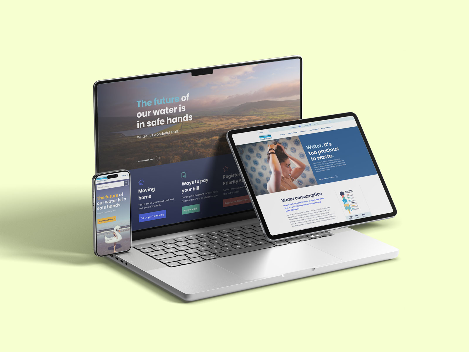
Moving to the build phase of the project with a clear objective and purpose, I led product design and content strategy for the new website, with a vastly simplified structure and customer-focused navigation. The redesign not only brought the new brand language to life online, but also delivered optimised customer self-serve functionality.
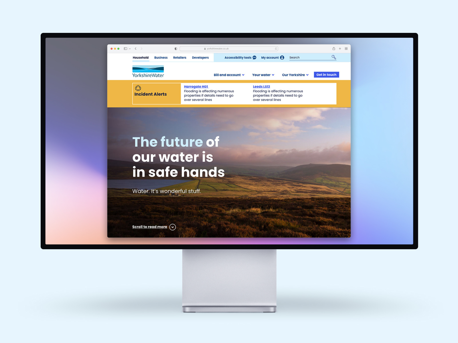
Yorkshire Water plays a key but often unseen part in the daily lives of 4.4 million people across Yorkshire who rely it for their water needs. A heavily regulated, quasi-public body, Yorkshire Water announced a five year plan to put the customer at the heart of the company, and is undertaking a digital transformation to ensure their online customer services and communications support this new customer-first approach.
CDS won the tender to support their internal design and development team in the redesign and rebuild of their website, but before we could do that we needed to define the role of the website amongst all their other communications channels. And to do that we also needed to understand how customers want to interact with Yorkshire Water digitally.
LESSONS LEARNED
Resolving a customer's query successfully is the ideal time to hit them with some good news.
When a senior executive declares "we don't know what our web site is for", that might seem like a worrying thing, but the honesty was refreshing. It was the starting point for open communication between client (Yorkshire Water) and agency (CDS) that actually allowed us to break down that client-supplier relationship and work together in a collaborative manner.
To find a purpose for the website gave us the licence to look further to find a solution, not just a narrow set of requirements to work within, or a redesign that is merely a superficial makeover.
So the challenge was not just to discover the role of the web site, but potentially of all Yorkshire Water's digital channels, including social media, chat and e-mail. None of them really worked in terms of meeting customers' needs. Customers and Yorkshire Water were still heavily predisposed towards offline channels - especially telephone.
Through our research and analysis, we learnt that the predominant reason customers visited the Yorkshire Water website was to find a contact telephone number, in order to speak to someone.
The most common reasons to call was to:
These are what we might call a 'distress visit' - the customer has a problem and they want Yorkshire Water to deal with it. A synchronous medium such as a phone call was felt by customers to be the best way that the company would 'take ownership' or the problem, and reassure the customer that it was being dealt with.
The digital tools that were on the site that could potentially relieve some of the burden on the call centre were often poorly integrated. For example the online report a leak service actually generated more work because it created a new incident each time it was used - there was no mechanism to check if was already known. This meant that in times of greatest customer need, such as the extensive flooding of winter 2015, Yorkshire Water would actually shut down their digital lines of communication and direct users to the phone lines.
This 'default to voice' mentality was stifling the opportunity for digital services to develop. This was in stark contrast this to other utilities brands, such as broadband providers, some of whom do not provide a contact phone number and offer no telephone support at all. Yorkshire Water did not want to lose that personal touch, but for users who had chosen a digital route, it felt wrong to bounce them to a phone-only journey.
Most customers visit Yorkshire Water's website on mobile, so it needed to provide a better experience on smaller screens.
Because the primary reason to visit the Yorkshire Water website and contact them was to highlight things that were going wrong, other content that the company published on the site went largely unseen. This made it hard for Yorkshire Water to talk about the good work they are doing to improve infrastructure, as custodians of the environment, or to offer good advice about saving water. So we wanted to consider ways that we could 'tell a bigger story' about Yorkshire Water.
LESSONS LEARNED
Take the lead, don't wait to be asked
This project was delivered by a truly collaborative team, with roles fulfilled between both the agency and the client. I was the lead designer on the project, working alongside a service designer, UX/UI designer, user researcher, a front-end developer and CMS developer from CDS. From the client side came a product owner, content designer, 2 UX designers, 2 backend developers, plus project management and infrastructure support.
I was the only member of the team to be involved throughout the duration of the project, (even from tender) and so was able to ensure continuity as we moved from discovery and definition, into design and development. But I feel I also stepped-up into a design leadership role, helping galvanise the team and push everyone to deliver excellence.
Additional support included accessibility consultancy, analytics consultancy and content strategy. McCann provided new brand guidelines for Yorkshire Water and a bank of assets.
We also had regular engagement with the change management team at Yorkshire Water who were looking to bring to life the Customer Experience vision across all channels, and whose work crossed over with much of our research and exploration.
The project consisted of two main phases, a service design phase and then the design and development of the new website. I was one of the few people from CDS who saw the project from end to end, connecting and driving the vision from the service design work into the UX design and realisation of the web site.
We started with a series of service mapping exercises for several key customer journeys, such as reporting an external leak (eg in the road), reporting an internal leak (ie on my property), querying a bill, moving house.
User research with customers then identified pain points in the steps of the journey: identification, notification, clarification, rectification and resolution.
Internal leaks were especially stressful and anxious events for customers, so the need for Yorkshire Water to take ownership was powerfully felt, even in cases where they were not technically responsible.
User journey mapping.
From the emergent themes came a set of design principles which would guide not just the work to deliver the new website but to align future activity.
Inspired by the Heath brothers' book The Power of Moments, we began to look at the experience of the Yorkshire Water service as a series of moments corresponding to each touchpoint and interaction of the customer with Yorkshire Water, and if we could lift the experience of those moments, especially the peak and end moments, then it could potentially turn a bad event such as a water leak into a positive experience in terms of customer service.
Having worked in customer service (another story for another time) I'm aware that it is generally only when something goes wrong that you actually get to demonstrate how good your service is. It is how well you respond to adversity and unexpected events that defines your values.
Analysing themes
Overwhelmingly, customers sought reassurance from Yorkshire Water when things went wrong, and a sense of taking ownership of a problem and getting it resolved. Traditionally, speaking to someone on the phone has often the most reassurance, a friendly, reassuring voice on the other end of line, taking control of the situation and guiding the customer through the resolution.
The key questions we asked was whether an online journey could ever offer that same level of reassurance? Why shouldn't a customer be able to report a leak online and get the same sense of Yorkshire Water taking control and ownership, or even better? This proved to be a lightbulb moment for conceiving of the role the website could play.
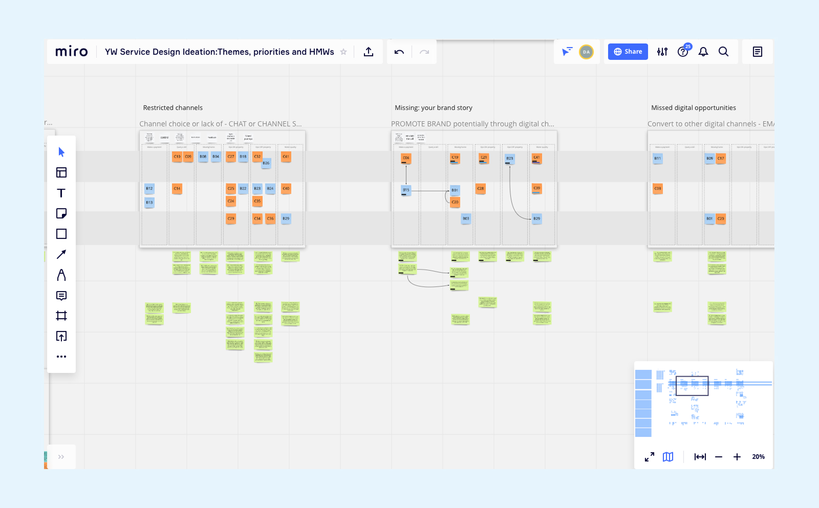
CDS ran a number of ideation workshops with teams at Yorkshire Water, to explore ways in which some of the themes we had identified could be translated into tangible enhancements to its digital channels.
It is important in these sessions to avoid jumping to solutions too quickly, to think that every problem has a directly corresponding resolution - this kind of sticking plaster approach rarely solves the underlying issues.
Having identified problem themes helped us avoid thinking too localised and small scale, we used a workshop technique called How Might We? to generate new questions that opened up the solution space rather than close it down with small scale solutions.
How Might We? sessions are powerful because they engage everyone in reframing the problem themes in new and interesting ways, they spark ideas and possibilities, and they allow the free-flow of ideas. Another benefit is that it helps unlock participants who have very fixed ideas on what the solution should be, to think about alternative approaches.
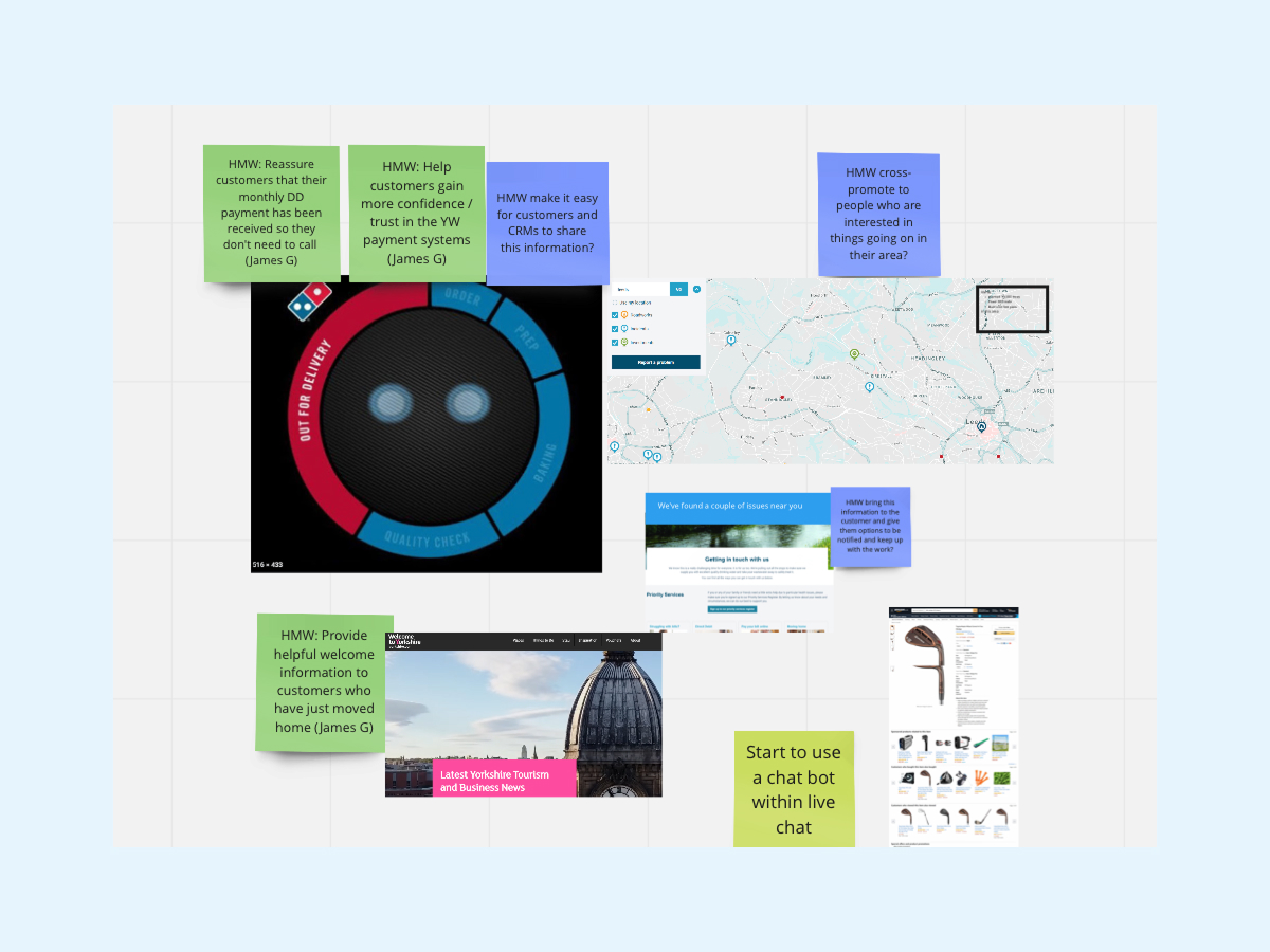
Some outputs from a How Might We workshop
We were able to translate what we had learned and devised, into a set of 10 design principles which could act as our guide for the next phase of our work, but also guide Yorkshire Water's internal CX team as they worked through other customer journeys and touchpoints.
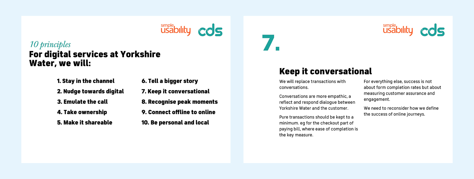
Documenting and socialising CX principles
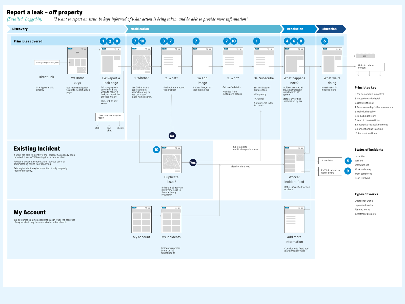
As an exemplar journey, we investigated the future state for one journey, an off-property water leak (eg in the road), and showed how the digital channels could create a vastly improved experience not only for customers but also streamline Yorkshire Water processes.
To help bring this to life, we created storyboards of the future experience, creating a narrative of how a leak is reported, repaired and resolved through a multi-channel, digital first approach that gives customers visibility and accountability of what is going on.
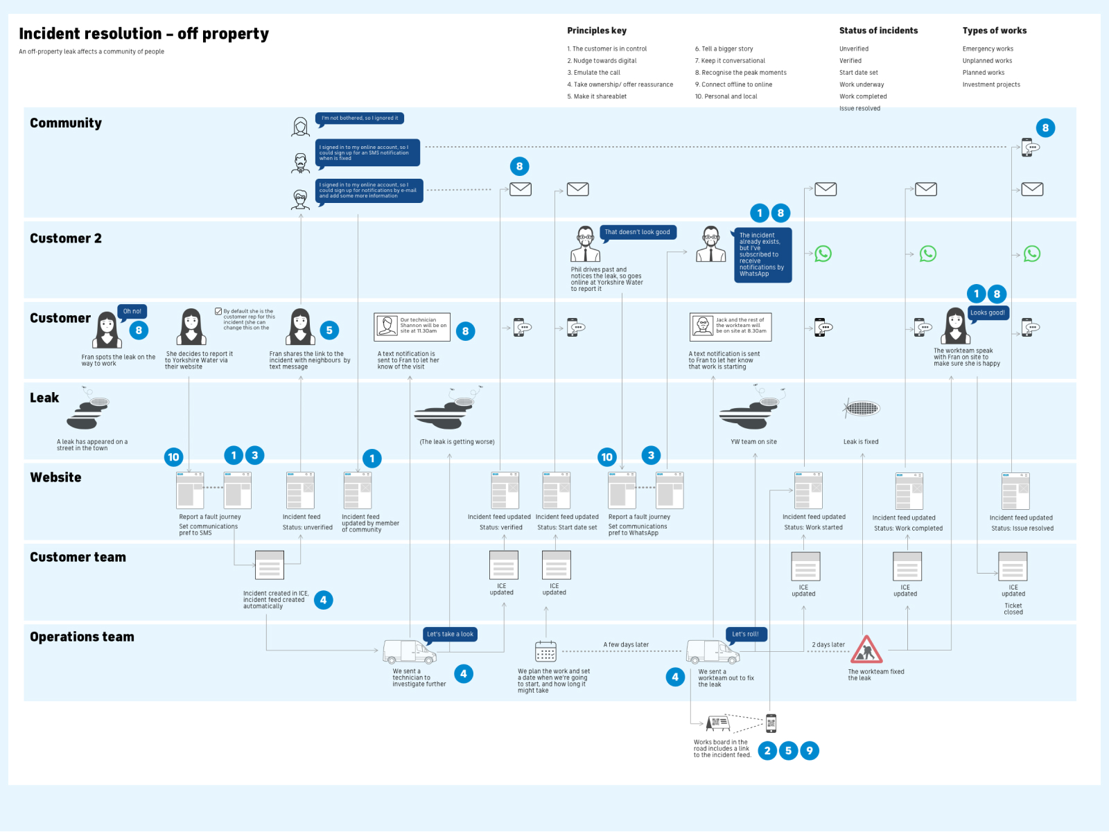
Bringing the to-be service to life with an exemplar scenario mapping how an incident could be resolved.

Storyboards helped bring the exemplar journey to life
"Designing a service is never done. It's only over when you go out of business" — Jamin Hegeman
LESSONS LEARNED
Good service design identifies a unique role for each channel
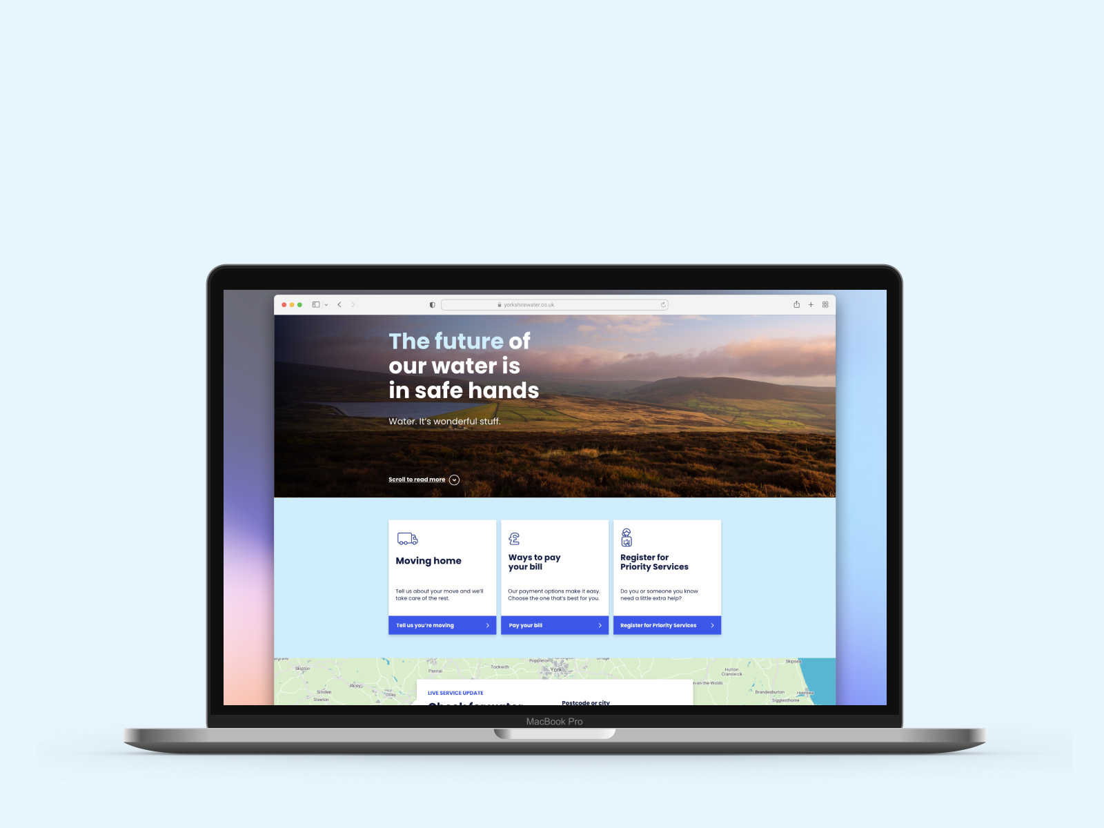
Following on from the service design work, we felt like we had identified a role for the website as a hub for customers, a central control point for them not only to transact with Yorkshire Water but also find out more information.
There were four main parts to our redesign work for the Yorkshire Water website that we needed to get right before the dev work could beging - IA, Content Design, UX and UI.
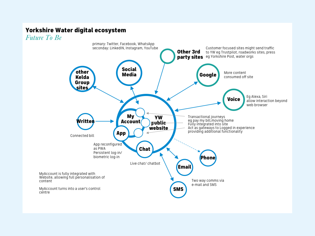
The future role of the website puts it at the heart of a multi-channel approach.
The existing Yorkshire Water site had a huge amount of content and lots of links, including huge amount of duplication.
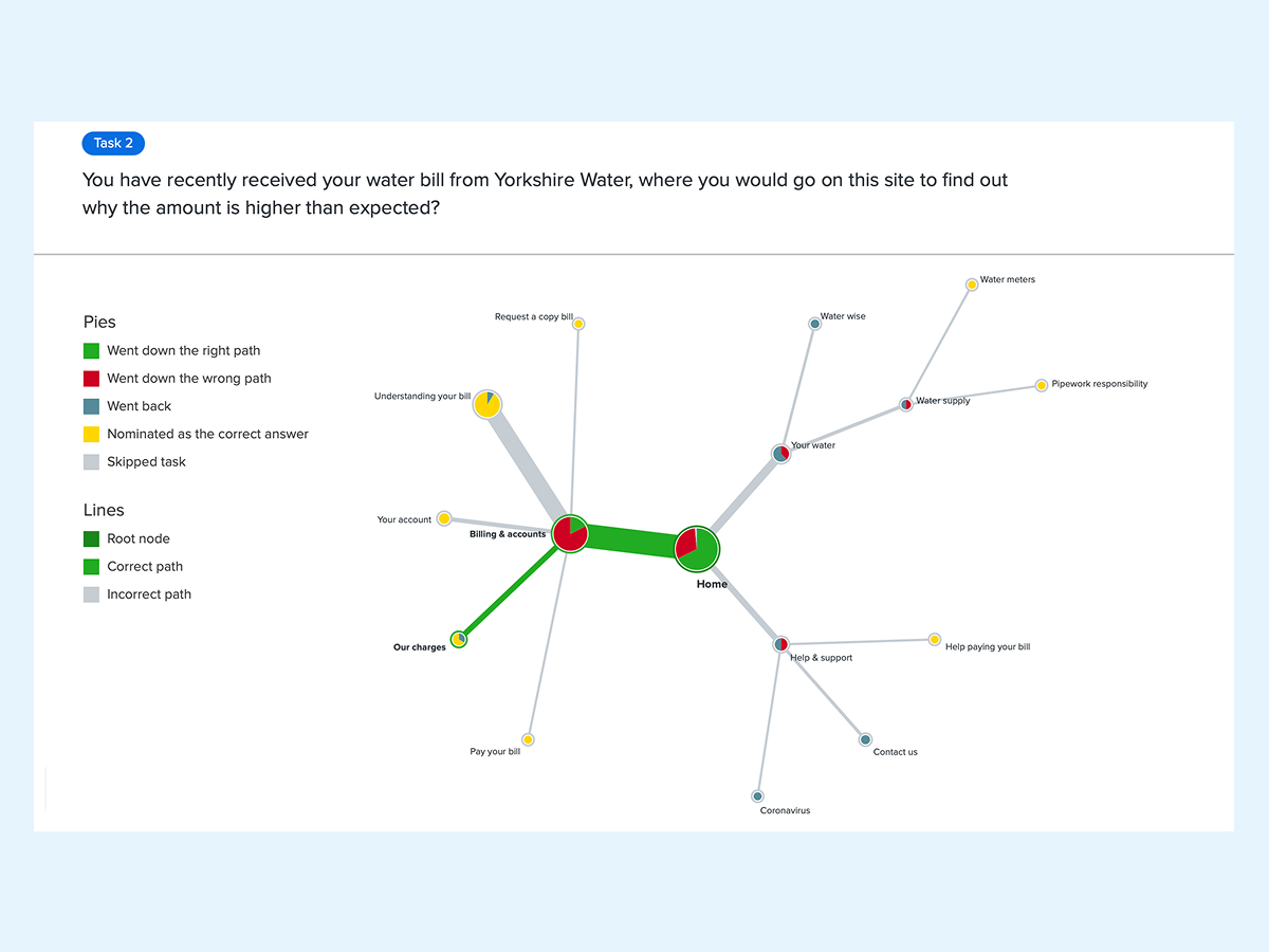
We used SEMrush to map all the links and content hierarchy of the site, and combined it with Google Analytics data to conduct a content audit and analyse site usage. This revealed not only that many of the pages were not looked at, but also that some key pages were not what users expected. Pages that had high page visits but high bounce rates were strong signals of pages that were underperforming in terms of content relevance.
In redesigning the information architecture of the website we agreed with Yorkshire Water to rationalise the structure, reducing the number of published pages, and setting the layers of content to a max of 3.
his also allowed us to set the site navigation to just 4 top level sections, and create simpler mega menus that used chunking to group together similar topics.
We ran tree tests using Optimal Workshop to test the new IA, and while it showed that users were able to get to the content they were after it also highlighted a misconception around understanding bills and water usage, which we then able to resolve.
Tree-testing the navigation helps identify taxonomical issues such as badly named links.
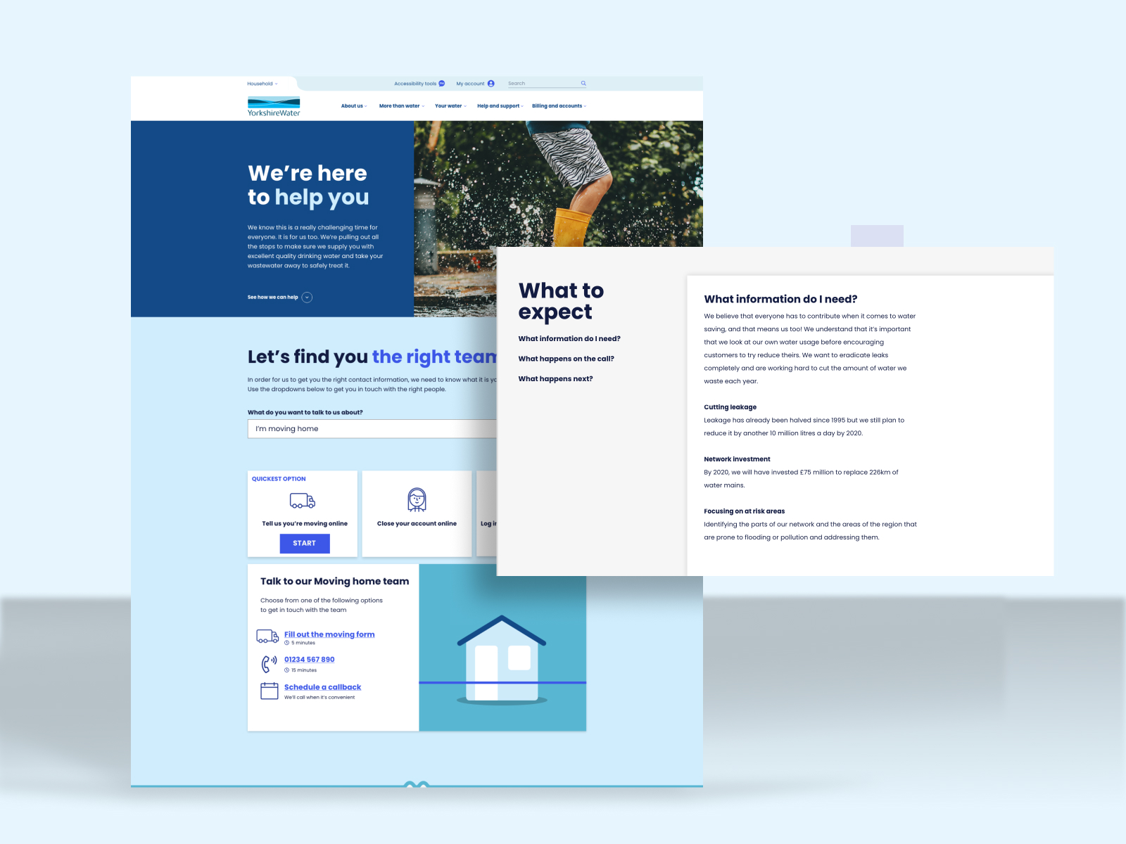
As well as an overall redesign of the look and feel, the UX design phase of the redesign of the Yorkshire Water website focused on 2 key user journeys - reporting a leak and contact. Other journeys such as online bill enquiries and home moves were pushed back to later stages.
As previously mentioned, previous online versions of reporting had failed during intense periods such as floods, primarily because the system treated each new report as a new incident (you see this problem on a lot of utility sites, eg Northern Powergrid). So in order to create a better system, we had to devise a to-be service map that could help distinguish between genuinely new incidents or whether it was a known incident.
The service map helped bring to life the experience vision we had previously created, but narrowed the scope of what could be implemented within the budget and timeframe.
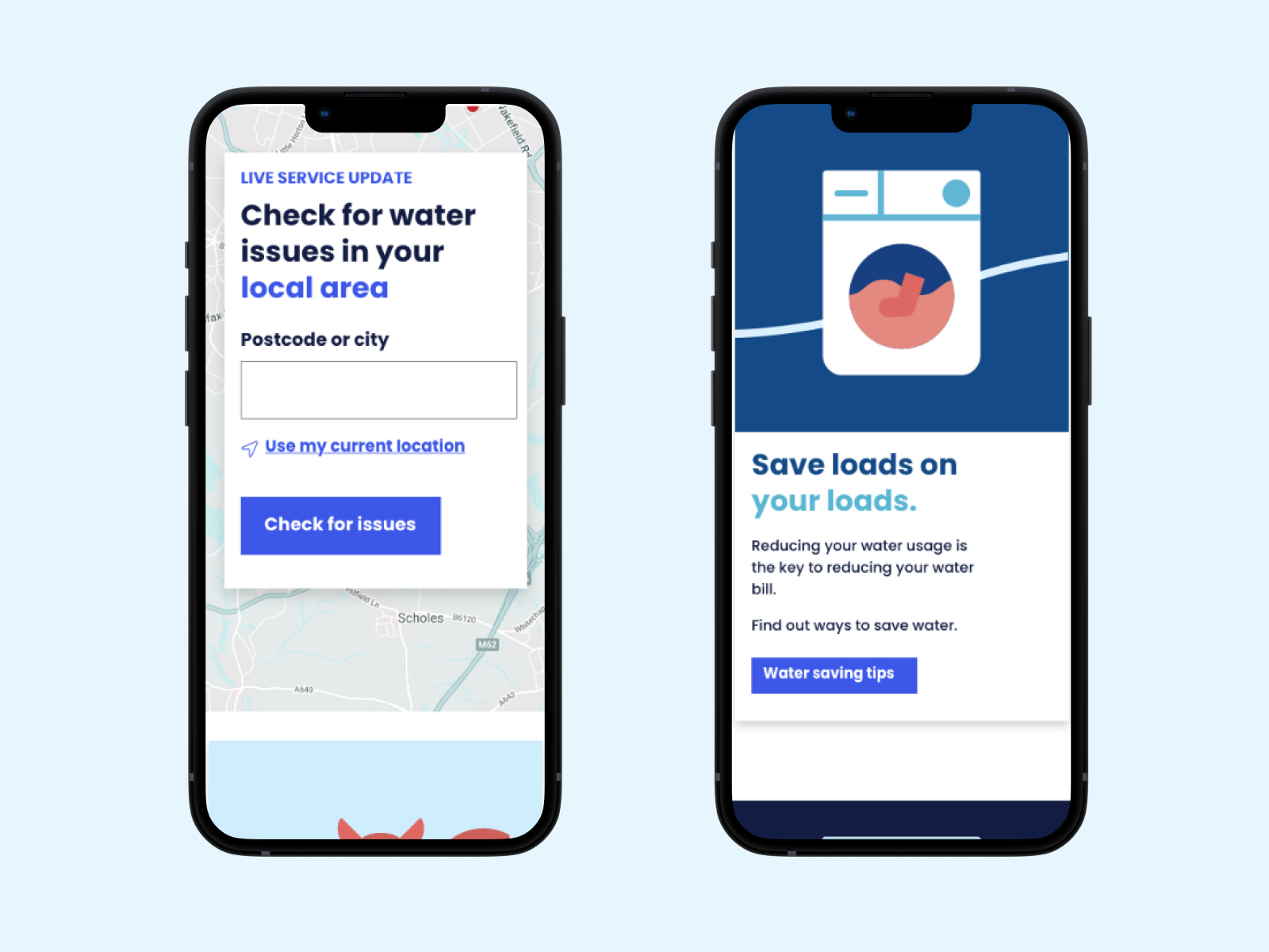
One aspect that was crucial to resolve was better mapping tools to help customers identify if the leak they were reporting was already a known incident, and used an API to determine between scheduled and unscheduled works.
We also added filters so that users could choose to only show relevant incidents, for instance low water pressure.
With the mapping systems updated and with incident duplicates reduced, working through the user journey for online reporting became pretty straightforward. However, the follow-up reporting, which we identified as being crucial for reassurance and information sharing, was not implemented. Our vision was that each incident could have a unique URL which would direct to an incident page with a log of activity, which could be shared across multiple channels.
Yorkshire Water were hidebound by an over-reliance on telephone support, even if there was online support and information available. Rather than force users into an online journeys (as many companies do, especially broadband providers), our concept instead was to capture the general nature of the enquiry, such as moving home, and then provide the options available: online service, telephone callback, or dedicated telephone line.
This put choice and control into the customers hands. This was reinforced by an estimate of the time taken for each of the routes, so for phone calls, the average wait time and the hours that the service was available.
With better signposting to relevant online information and other contact methods, the website is friendly, reassuring and informative - it doesn't force users down an online route but gives customers the choice that suits them.
It is the essence of the new role for the website as a control centre and infromation hub for customers.
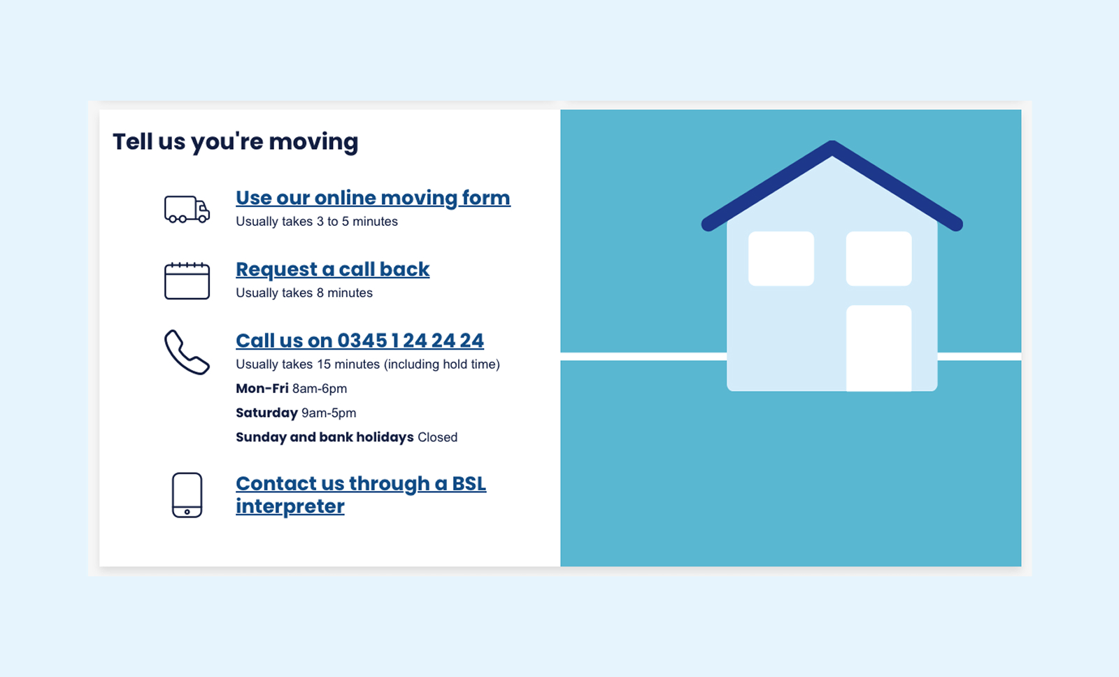
The contact us journey allows customers to choose the option that suits them best.
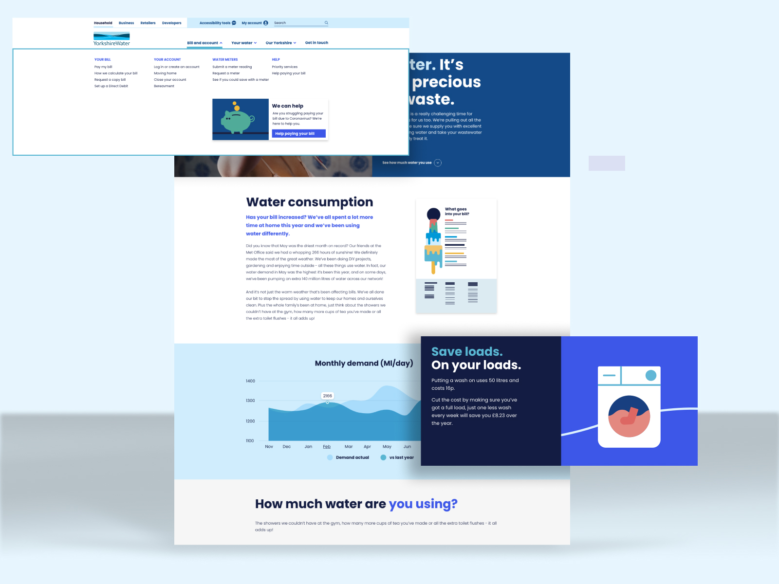
As part of the redesign, Yorkshire Water also underwent a comms refresh, undertaken by McCann, who created bright new colour palettes, new typography, guidance on tone of voice and imagery. They also created banks of imagery, including photography, iconography and a suite of playful illustrations.
Our role was to integrate and 'activate' this new brand language for the website. While McCann had provided a set of content components, there was little guidance on how they might work together, especially on long-form content such as a webpage.
Some challenges, for instance, were how to combine colours, and also how to integrate photography and illustration.
Through the design process, creating wireframes and mockups, we were able to establish some guiding principles for the page layouts that worked well, and tested well with users. In some of the early mockups we had multiple illustrations and lots of colour on one page, and it felt too childish. So we identified that we needed to use illustration sparingly, and also focus around 2 main colours, with other colours being used as occasional accent colours.
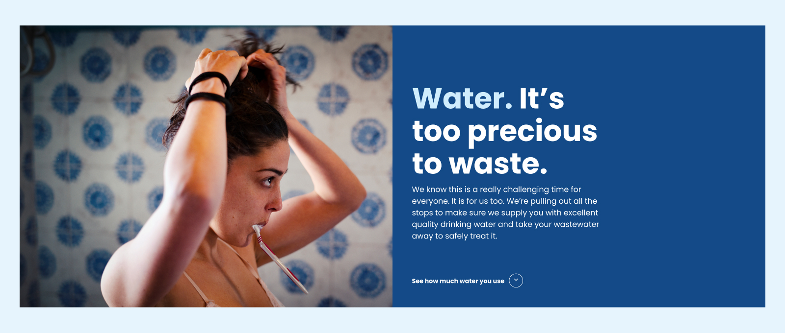
The new branding encompassed imagery, colours, typography and tone of voice - we had to figure out how these new pieces should fit together.
The UI design of the Yorkshire Water site aimed to create a clean, consistent visual identify with clear calls to action and signposting to relevant content. It was designed 'mobile-first', using responsive design principles to ensure that it looked good and worked well on larger screen sizes: tablets, laptops and desktop computers.
Cards are a key UI component and design pattern for combinining content with CTAs for interaction or linking. We devised a number of different card types for different types of content and use situation.
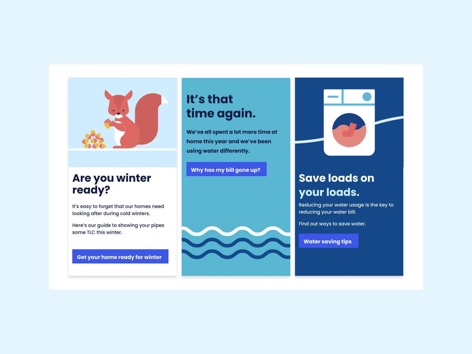
Exploration of cards design pattern.
On mobile, cards arrange content vertically, and multiple cards stack vertically. On larger screen sizes, content may be placed side by side, and the cards themselves may be placed in a grid.
A huge part of responsive design for CMS driven web sites is determining how cards will wrap, stretch and flow at different screen sizes, and with varying numbers of cards.
Thoughtful menu design was crucial for the redesign to avoid the confusion of the previous version. On both mobile and desktop menus. we wanted to avoid a huge list of menu items. Using the Gestalt principal of proximity - or 'chunking' - grouping links together under subheadings made it much easier to 'read' the menu and get to the right link.
A similiar chunking principle was used on form elements, such as the drop-down lists on the contact section. Using option groups with a header label makes it much easier to read a set of 20 options when they are divided into 4 sections. This is where close liaison between design and development really helped, to ensure the design intent was realised in code.
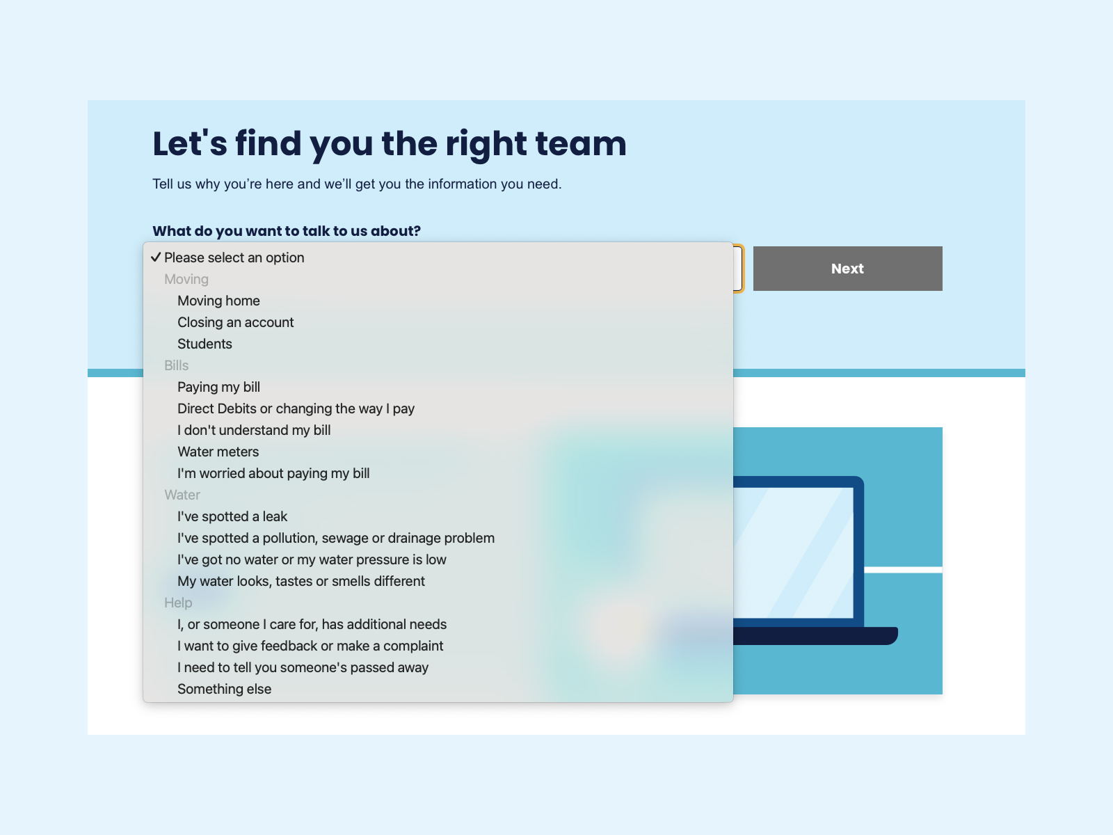
Links are grouped together to aid readability
The new website went live in 2020 and was well received by customers. The biggest short-term impact the new website had was in a reduction by 20% of telephone calls to the support centre, a huge cost saving to the company.
A second win was in terms of an increase in the C-MEX score from Ofwat, the water regulator. Ofwat conducts independent analysis of all water companies, and publishes league tables ranking all water companies, with the C-MEX score calculated on a combination of customer experience and customer satisfaction scores. The increase in Customer Experience helped Yorkshire Water improve their 2020-21 C-MEX score and led to a £466k 'positive financial payment' (compared to Thames Water who received a £16.75m 'negative financial payment').
Less tangible outcomes were not only an enhanced customer experience but also a clear identity and role for the website that could be used as baseline work for years to come.
But the work I am most proud of is the foundational service design and experience vision work which underpinned and informed the UX work. Without it we would not have been able to come up with such well resolved user flows and content design. Understanding customer needs and knowing exactly which themes and principles we were applying to each piece of content allowed us to move at pace and with confidence.
The playbook of design principles we created to assist us was also a vital asset to help guide the CX team as they looked to create online journeys for a number of services.
The project won Gold for 'Best Use of Digital from the Energy and Utilities Sector' at the Digital Impact Awards 2021.
TOP TIP
Keep the conversation going by sharing what you have learned, both internally and externally.
The Yorkshire Water was a great project to work on, with a passionate and engaged client, a dedicated team of experts, and a remit to look beyond the confines of a website 'refresh'.
Ultimately, you will always find out far more than you can fix, but looking wider allows you to find bigger themes. So a challenge is to be ruthless in prioritisation, to keep narrowing in on the problem, and move from the macro to the micro. Key themes might resolve themselves into a UI element such as a drop-down select list.
You can add delight to even the most mundane transactions when you are building from a place of deep knowledge of customer needs, and a core set of principles of how to activate those principles.