TL;DR — Truly understanding what patients want to do is the key to unlocking website purpose
Work completed while working at CDS.
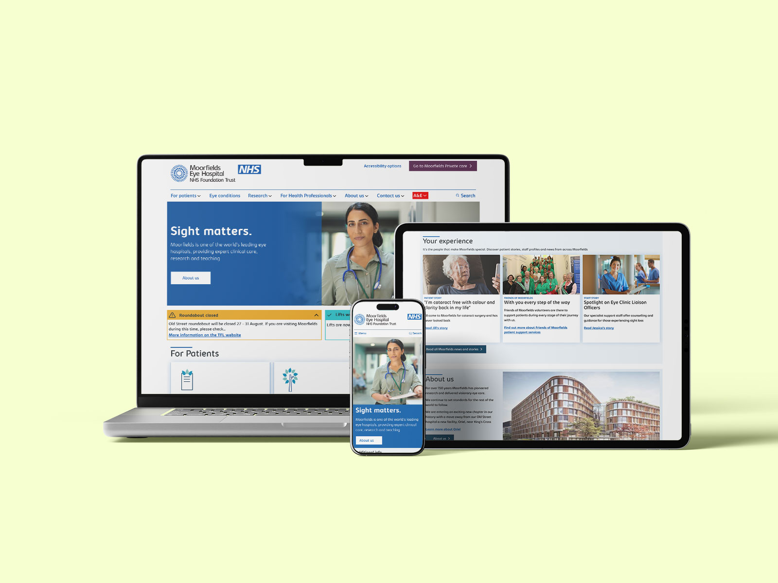
As the first phase of a digital transformation project, I led a team to redesign both the Moorfields NHS Trust site and the Private Care site.
After leading analysis of the user needs and business requirements, I planned a set of design activities that would resolve the key unmet needs within the budget, with the driving principle of delivering a patient-centric experience across both sites.
Working with a hybrid, multidisciplinary team across the agency and client, I led UX and UI work, using an agile approach of a series of 2-week design sprints during which features would be designed, tested and iterated.
Once into development, I supported the engineering and CMS teams by producing a full set of UI components, styleguide, and directory of content blocks, building a design language that married the NHS design system with Moorfields own brand guidelines.
Once live, Moorfields saw increases in conversions for the Private Care site and reduced telephone calls to the NHS Trust support number. The design work established the foundational design language and methodology for future phases.
LESSONS LEARNED
When taking over from an existing supplier, make sure you're not repeating work that is still valid.
Moorfields Eye Hospital has an international reputation as a leading centre for treatment and research of eye conditions, and operates both as an NHS Foundation Trust and as a private treatment centre for UK and overseas patients. As well as the original Moorfields Eye Hospital in the City of London, Moorfields operates a number of satellite centres across the UK, and private clinics in the UK and the UAE.
Moorfields is currently undergoing a transformation project that will see the hospital depart its Old Street home and move into a new building Oriel, near St. Pancras where treatment, research and teaching will all be brought together.
Alongside the physical transformation came a need to restructure and redesign the digital estate to align with the new vision for Moorfields, a digital home to unite patient services, research and education.
Moorfields began the project with another agency but quickly felt that they were not delivering the right solution or working in the right way, so CDS were appointed to pick up the pieces and see it through. Validating what had been done before to see if any of it was still useful was a time-consuming but necessary first step.
LESSONS LEARNED
Don't just think about the outcomes you want to achieve, also think about how you want to work together.
The scope of the initial project focused on a redesign of the main Moorfields website and that of Moorfields Private Eyecare site, migrating the site to a new CMS.
As part of a kick-off workshop we conducted an exercise to help the team understand what a successful outcome would be for the project. Defining "what does success look like?" at an early stage helps get alignment. Interestingly, as well as outcomes for improved patient experience, one thing that came through strongly from the client was a desire for a strong bond and clear communications with the supplier, recognising that good outcomes only come out of good process.
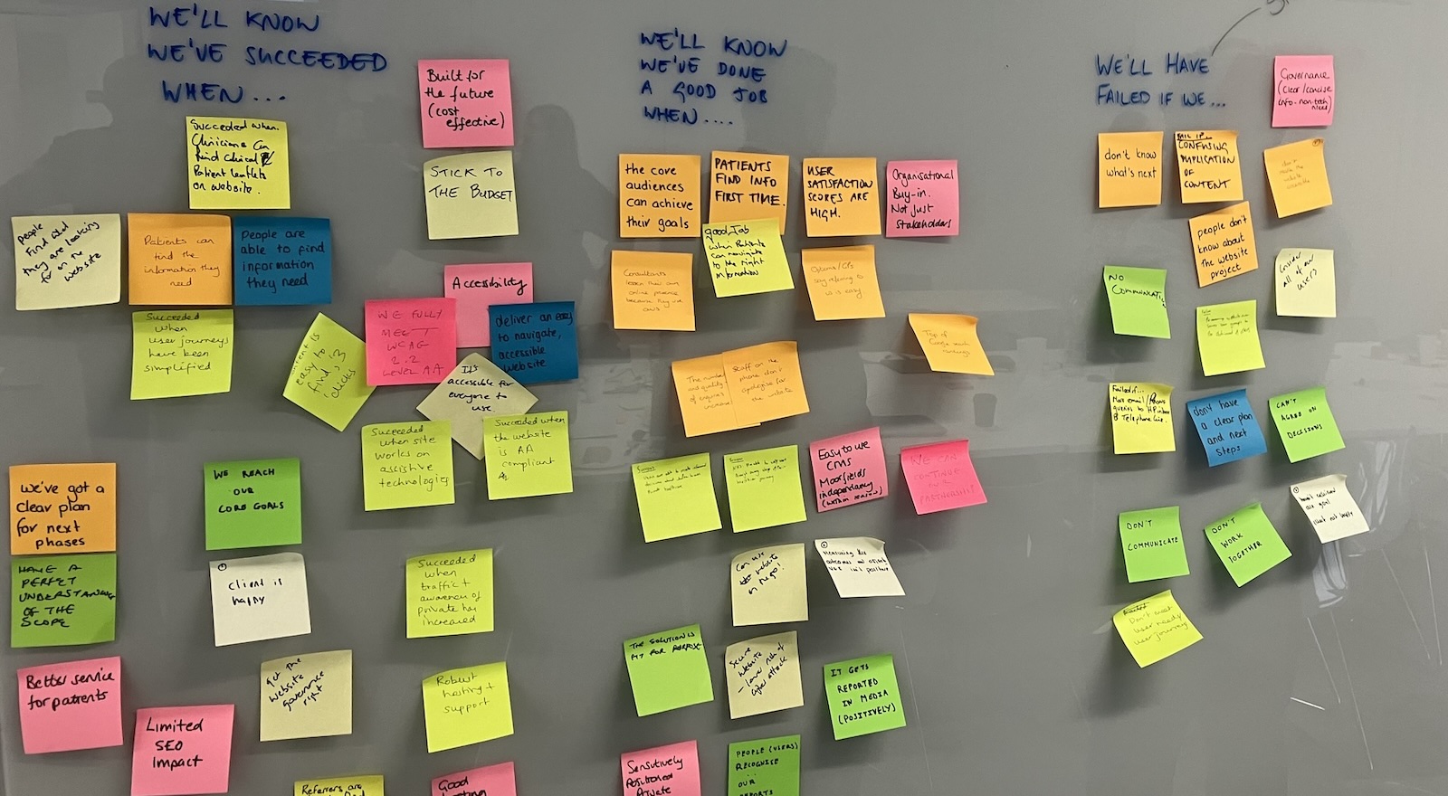
Shared post-it notes from workshop session to get alignment on what does success look like, and spotting red flags that things might not be going well.
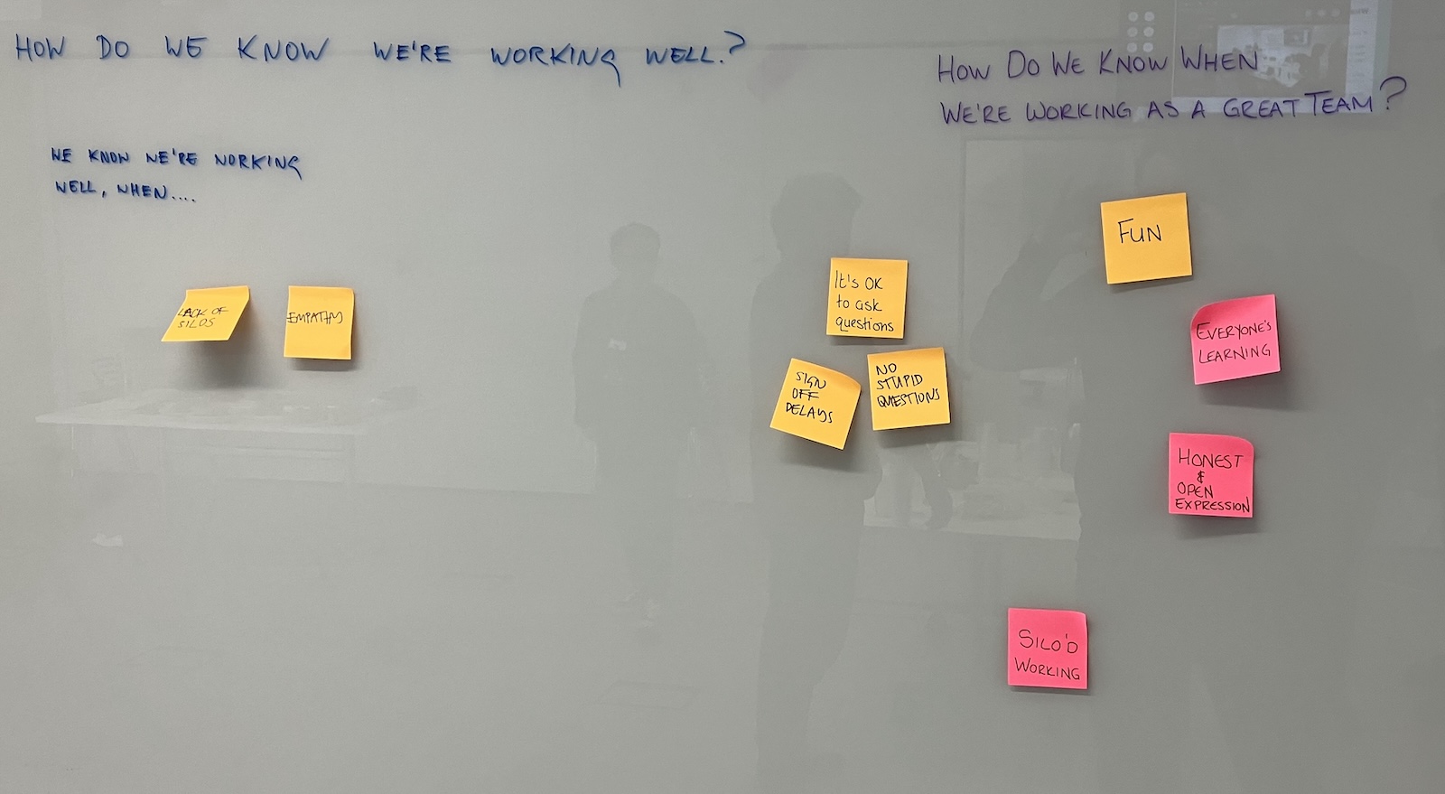
Exploring how we want to work together
Digital design projects are rarely 'green-field' projects starting from nothing, instead transformation projects usually arise out of a dissatisfaction with an existing site or service, which is not performing as required. There are almost always two sides to this dissatisfaction - that it does not work well for users, and that it does work well for internal teams. Both aspects need some unpicking.
Understanding what was not working for the current Moorfields digital estate involved analysing the existing service, conducting reviews with stakeholders and users, and look into relevant datapoints.
From user research and expert review, it was clear that the site not aligned with user needs, especially the primary users, patients. Key issues were:
For Moorfields themselves, issues with the design and CMS made their lives harder and impacted the brand messaging they wanted to communicate:
My role was as design lead, supported by a service designer, user researcher business analyst and project manager on the agency side, and with a content lead, comms leads for NHS and Private care site, and an in-house user researcher.
We quickly developed a great working relationship and rapport with the client, who were highly engaged and supportive throughout the project. They gave robust feedback without dictating what the outcome should be, which helped foster great trust between the teams.
There are few things more dispiriting to an agency than a client who thinks they need to tell you what to do all the time. The best agency-client relationships are built on mutual trust and respect.
In our initial audit of the existing site we found a very unfocused home page which did not signpost well to key content. Links to important content, such as eye conditions, were buried.
Creating a website structure and navigation that replicates the internal structure of the organisation is a trap that I see so many organisations fall into. Its a perfect example of Conway's Law in action.
"Organisations which design systems are constrained to produce designs which are copies of the communication structures of these organisations"
— Melvin E. Conway, How Do Committees Invent?
Adopting a user-centred approach is an ideal way to break out of this trap, focusing on journeys rather than information silos.
We decided that patient journeys — such as preparing for an appointment — should be at the forefront, with services for other audiences — health professionals, students and researchers — pushed back but clearly signposted.
This overriding design concept and content strategy then allowed everything else to fall into place, driving decisions on IA, navigation, content structure etc.
From the emergent themes came a set of design principles which would guide not just the work to deliver the new website but to align future activity.
From a huge number of identified user needs, and client needs, using a MoSCoW analysis we were able to prioritise certain needs.
We were then able to scope work to certain areas which would believed would resolve these needs, for example fixing the navigation would help reassure users they were in the right part of the site.
Given that there was a limited budget, it would not be possible to do all of this work in the first phase, We estimated the effort to explore each one, using T-shirt sizing, and conducted a prioritisation workshop with the client so that everyone was aligned on what would be investigated first.
From the initial audit of the existing site, it was apparent that it did not work well at smaller screen sizes, with almost no consideration given to users on mobile devices.
Another key failing was poor support for users with accessibility needs, for example screenreaders, with badly structured mark-up but also lack of thought about users with impairments, such as multiple buttons with CTA's reading 'Click here'.
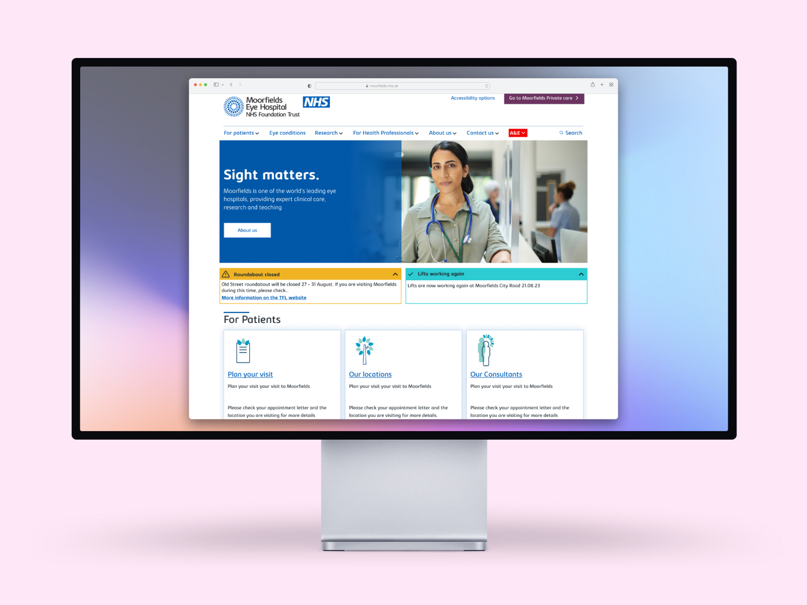
With Moorfields being a specialist eye hospital, it was especially important that the site worked well for users with visual impairments, so consideration of things like colour contrast, text size, screenreaders, were especially important. Making accessibility a priority, with a desire to make the site not only meet WCAG 2.2 'AA' compliance but aim for 'AAA' in areas related to visual accessibility.
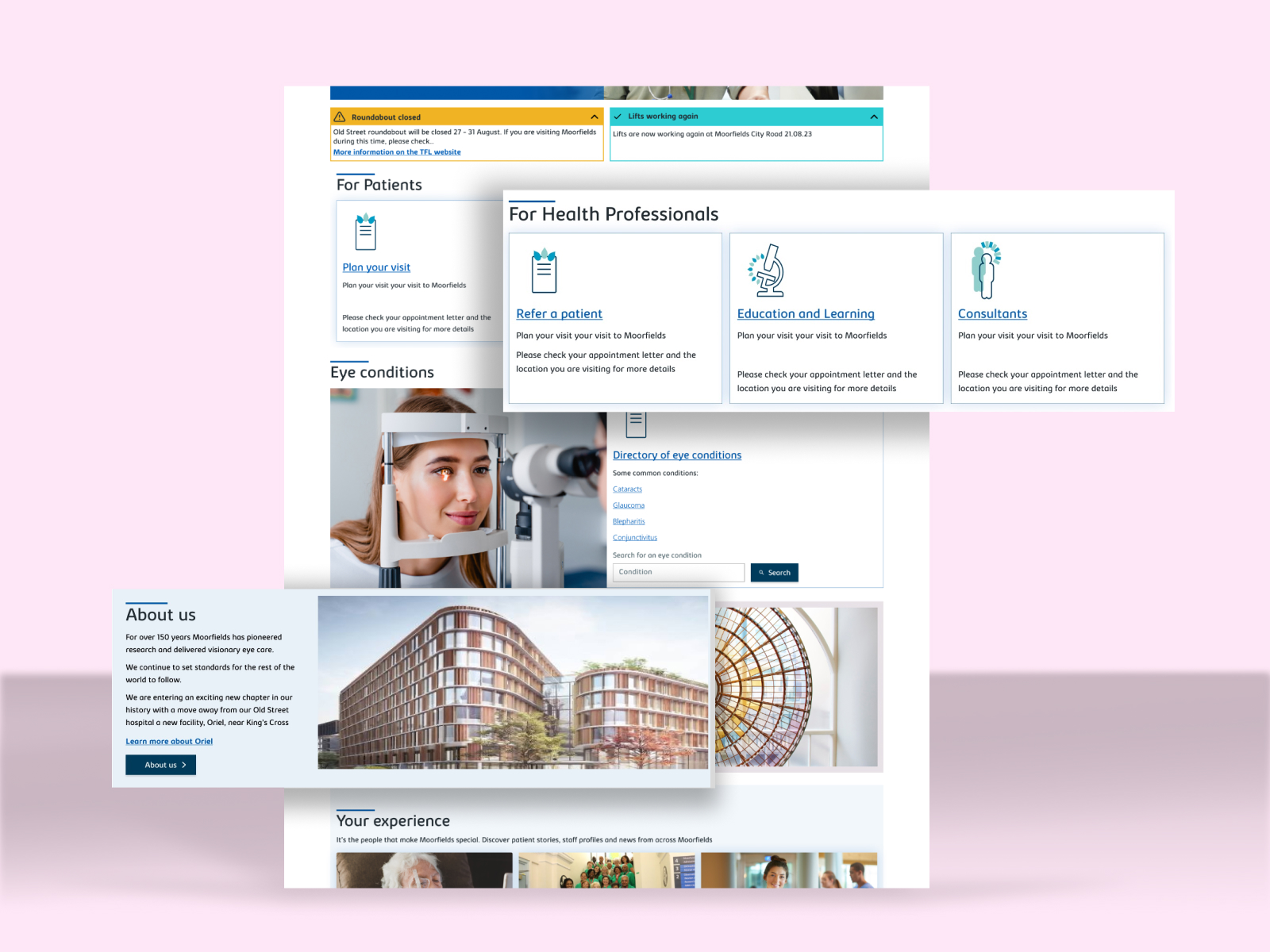
Realigning the site to be centred on patient needs gave us a clear direction to start restructuring the information architecture of the site, not only the site structure but also the menus and navigation, and the page layouts.
As a guiding principles I was determined that there shouldn't be more than 6 top level sections, and that there shouldn't be more than 3 main levels deep for the majority of content. Simplifying the site structure may seem obvious but getting the balance right is key, oversimplifying actually makes it harder to use when the groupings or taxonomy you implement doesn't resonate with users.
I supported Moorfields' content editor in redefining the IA of the site along these lines, which was tested with users, and refined accordingly.
With the IA along the right lines we could design the menus. This required many iterations to get right, and ultimately did not go live as designed, because it was decided that the menus should be automatically generated rather than manually created. A manual menu creation tool within the CMS would have allowed much greater control of the layout and appearance of the menu but would have been additional work.
While the menu options were nailed down early on, it took a few iterations to get the layout right.
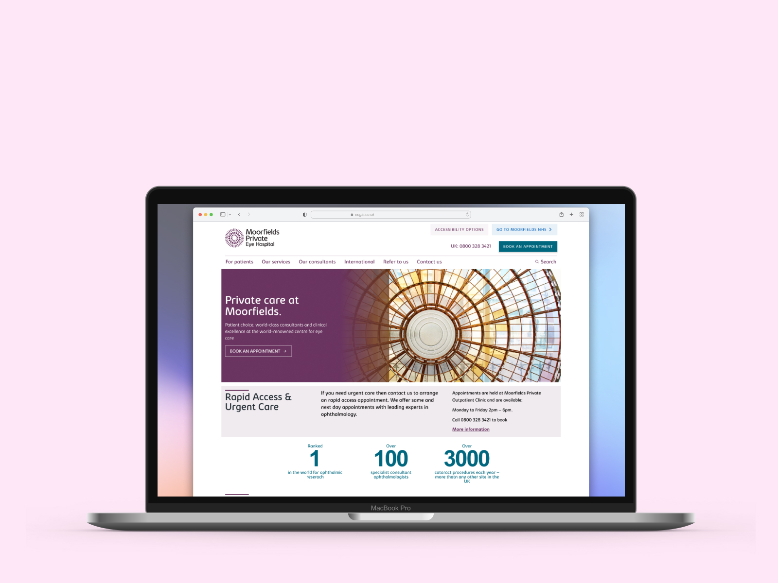
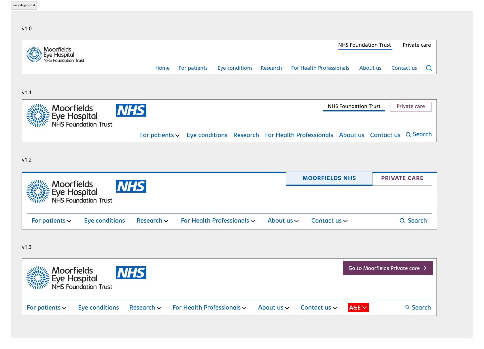
Making the Moorfields NHS Trust website and the Private Care website look and feel more aligned was another key design decision. Even though they had different audiences, we felt that there unifying certain elements such as the header and menu designs would enable a consistent Moorfields look and feel, and cause less disorientation if navigating between them. Styling the link to connect the two sites was something that also underwent numerous iterations.
I also wanted the NHS Trust site to adhere more closely to the NHS design system, utilising components and patterns where applicable. Moorfields also had their own brand identity, including a logomark, colours, typography, illustration style and visual patterns.
Finding the balance between a unique design treatment and the NHS service standard was a key challenge, with a design approach that could be made to look and feel like an NHS site and be adapted to create a bespoke, premium experience for the Private care site.
Having a unified approach to these sites also paved the way for future sites within the Moorfields family: Moorfields Charity and Friends of Moorfields, which were out of scope for this project.
One of the challenges for the NHS and Private care website was how to handle content that needed to be shown on both sites. Having adopted an approach to duplicate content across the two sites, Moorfields had found themselves effectively competing with each other for SEO ranking, and also having to ensuring content was sufficiently different to avoid a duplication penalties by Google's algorithm.
The solution seemed simple enough, but getting everyone to understand the options and implications was generating a lot of confusion, so I stepped in to create a diagram that could be used to frame discussion with our developers, the client and their SEO agency.
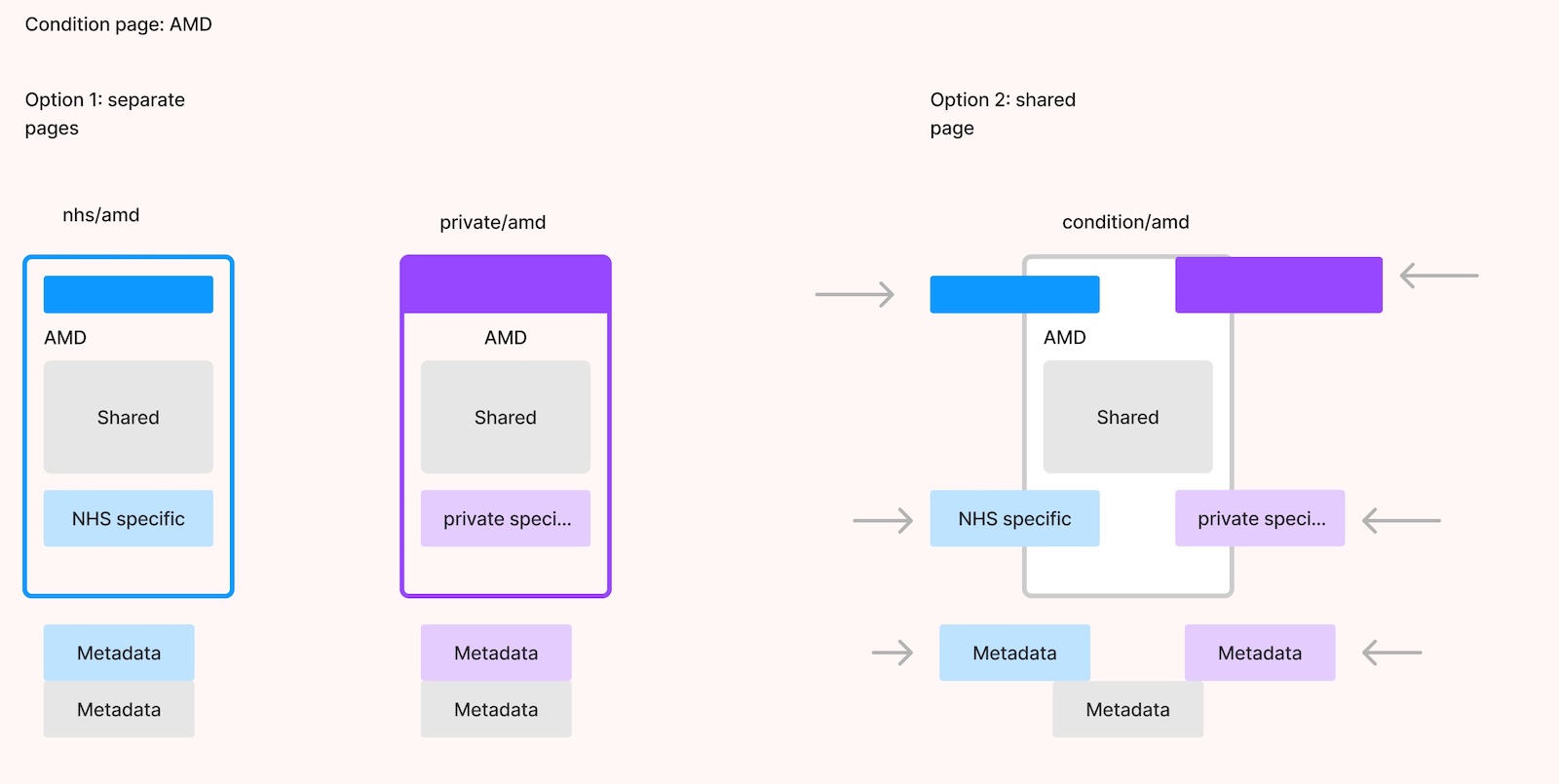
Exploring two options for managing content in the CMS. The second option was thought to be the best approach moving forward.
As a UX designer, able to bridge conversations and interpret between marketers and developers to get best solution is a vital skill that often goes under the radar. Here a picture spoke a thousand words.
With an agreed solution in place it was possible to have one piece of content shared between NHS and private care site, augment with site specific content if required, and with a canonical URL, ensure no SEO competition, or penalty for duplication.
LESSONS LEARNED
Working at speed requires meticulous planning.
As the design evolved over several design sprints, and more sections of the site were created, a consistent set of page designs and content blocks began to emerge. Also, places where there was inconsistency in design patterns began to show, for example in various card types, so a stage of design refactoring was needed to ensure a consistent and logical approach.
Because we were delivering a set of CMS blocks rather than a fixed set of page templates, documenting the variety of content options became an important step.
I put together a content block directory showing the possible configurations of key content components such as cards, accordions etc, as well as states and variants for interactive components such as buttons and form fields.
This stage of product documentation is a key part of handover, not only to the developers so they know what they need to build, but also to the client who needs to understand what block types they have available to populate with content.
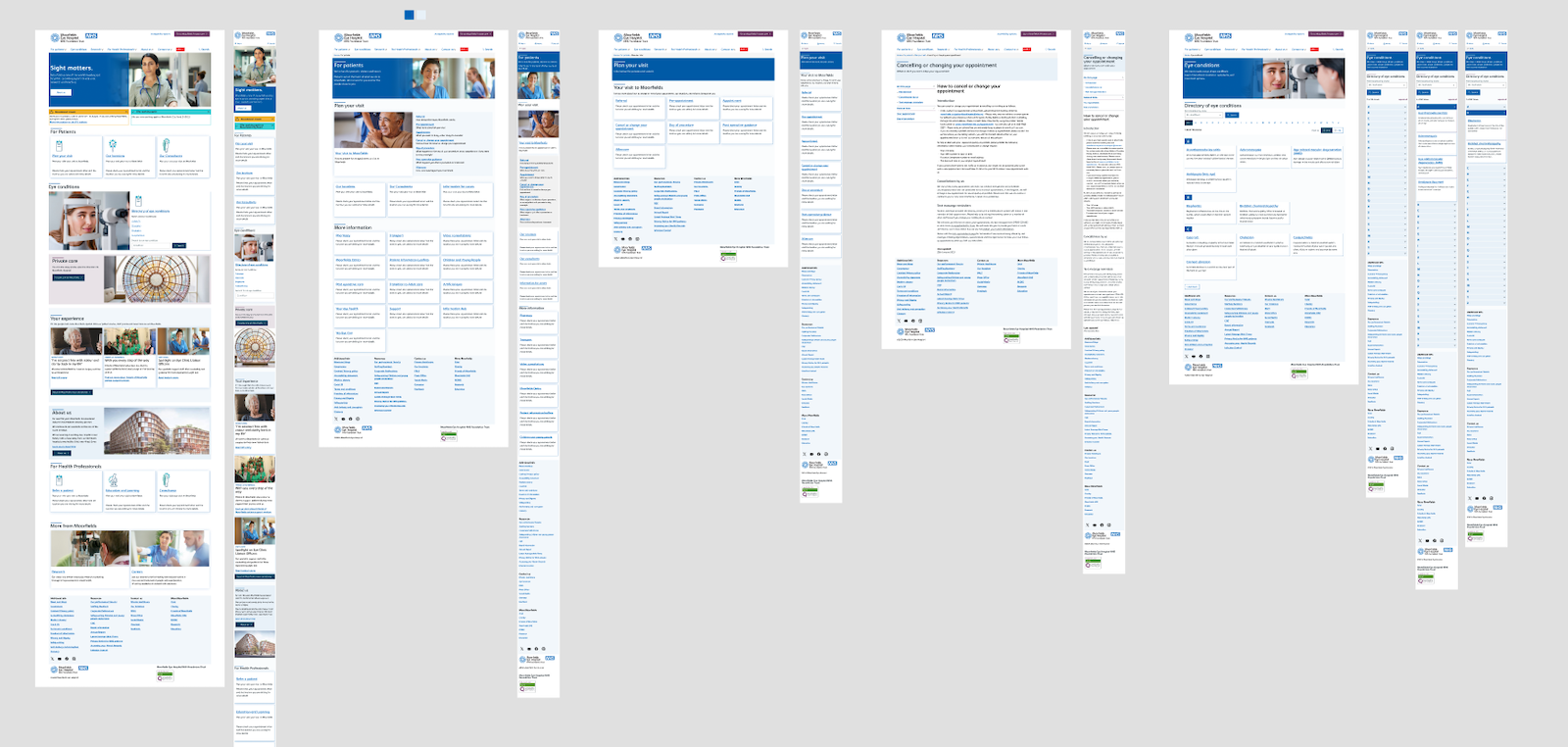
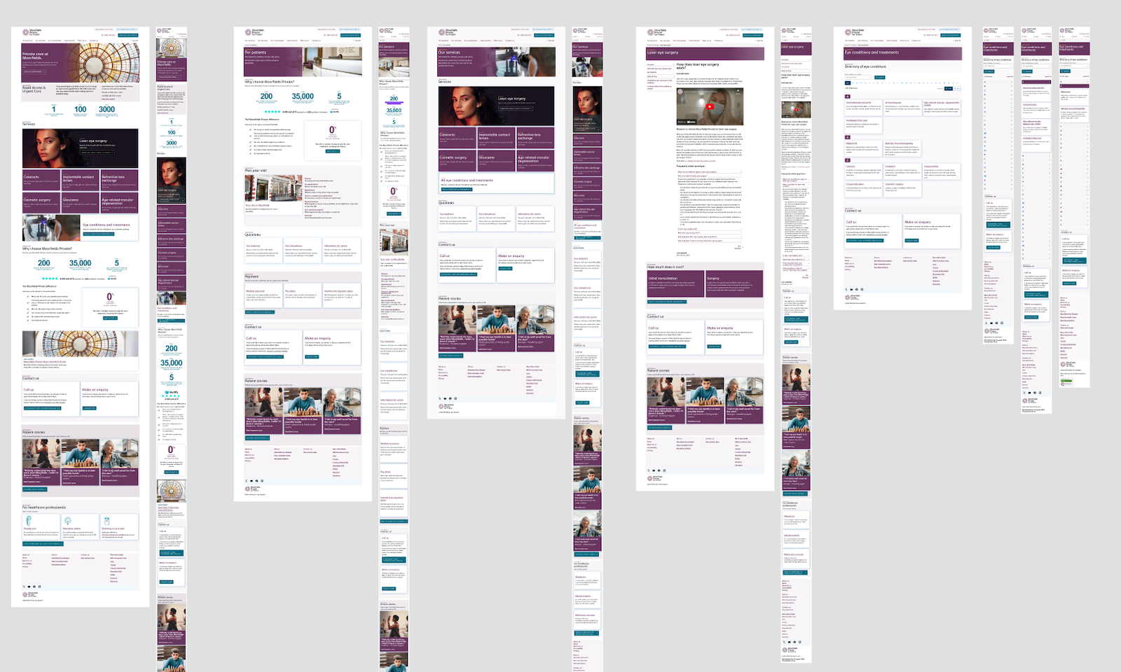
Designs were created for both desktop and mobile.
In the original work done by another agency, there was the crux of a really interesting idea, which was that consultants, eye conditions and treatment locations were related entities that could be linked. Creating connections between these three types of content could allow a user to start at any one of these three entities and see the connections, for instance by looking at a particular eye condition they could see all the consultants that specialised in that condition, and all the locations where that condition could be treated.
While not as valuable for NHS patients, for Private Care patients who have more choice about where and which consultant treats them, this felt like a powerful way to help users find their next step, or further options. It can prevent users reaching a dead-end where there is no clear signpost to relevant additional information.
Thinking about interactions and content as related entities is a central part of Object Oriented User Experience, a design methodology as championed by Sophia Prater, and what I call Relational UX. Where you need to be careful with this approach is to ensure that the objects and relations you are prioritising are the ones that are most valuable to the user. In the case of Moorfields, the needs of patients were much more centred around visits, appointments and treatments, which had barely been considered at all by the previous agency.
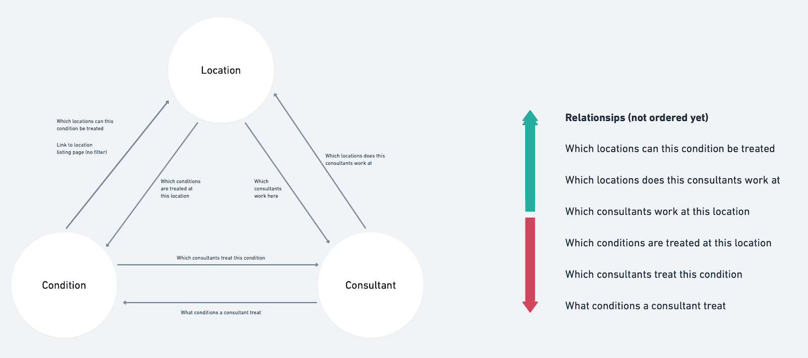
An initial concept for relational UX
The design was iterated over several design sprints, responding to user feedback, client reviews, and internal review. As well as adding new sections of the site, amends were made to previously designed screens, and refinements made to core site elements such as the headers, footers, menus etc
Reviewing the designs with our accessibility expert helped us ensure any issues were spotted ahead of build. An example of this was the designs for notifications. I wanted to add different levels of notification so that they felt calmer - minor inconveniences or points of information should not shout as loud as major incidents, but by only using colours to distinguish these it failed a basic accessibility principle. Adding icons resolved this, but also adjusting the colours to add better differentiation for users with types of colour blindness — simulated using the Stark plugin in Figma — improved things further.
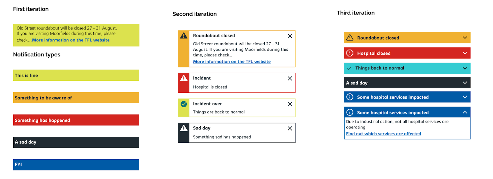
Iterating the Notifications block
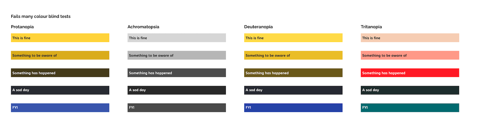
Testing the notifications against different types colour blindness
Clickable prototypes were created in Figma to test with users, with rounds of research every two weeks during the design sprints. These gave us clear indications of where the new site was meeting users' needs, and where it was not yet working to resolve the pain points previously identified.
User research, conducted by Moorfields' inhouse user researcher and supported by a user research specialist at CDS, was partially done in a 'guerilla method' — recruiting participants on an ad-hoc basis, often from patients waiting for appointments in the hospital itself. While this methodology is not suitable for extensive testing, it suited the rapid iteration approach we had chosen, and meant that these were genuine users of Mooofields' services and likely website visitors.
Other prototypes and assets were created to show to client and developers how interactions, including animation timings and transitions should work, for example how the menus should work on mobile.
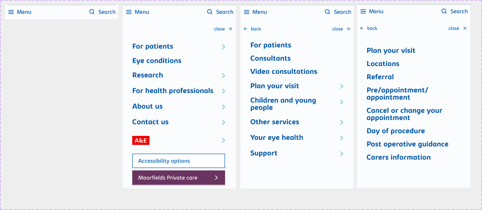
Prototype of the mobile menu
Making the site an exemplar for accessibility for users with visual impairments was a guiding principle for the design of the site, with the aim to meet AAA compliance for visual issues.
Plans to add a dark mode and a high-contrast mode were also explored to be implemented in future stages.
We pushed back against the idea of implementing a third party set of accessibility controls, such as ReciteMe or AccessiBe, as these often add more issues than they resolve. Our guiding principle is to allow users to adjust settings themselves via the default device and browser settings.
Moorfields were also keen to ensure that the site scored highly on the Silktide Index ranking for accessibility for NHS websites, but being an automated ranking means it doesn't always represent genuine accessibility.
LESSONS LEARNED
Always get baseline metrics of the sites you’re redesigning.
Since the site went live, Moorfields have reported high levels of user satisfaction with the site, with users being able to complete tasks and find content. In terms of metrics, there has been a reduction of calls to the NHS switchboard, freeing up staff time. Page load times were reduced to under 2 seconds, a combined effect of clean design, clean code, optimised CMS and hosting.
The Private Care site has seen the most measurable improvements, with higher search ranking for key terms, increased page views, and most importantly, an increased conversion rate for enquiries, both via telephone and the online form. Webform conversions reached 8.2%, and phone conversions hit 4.51%.
Not least, a great working relationship based on honest, open communication ensured that CDS were retained to work on future phases of the project. A hybrid, multidisciplinary team can achieve extraordinary results in incredibly short time when everyone is aligned, motivated and supported.
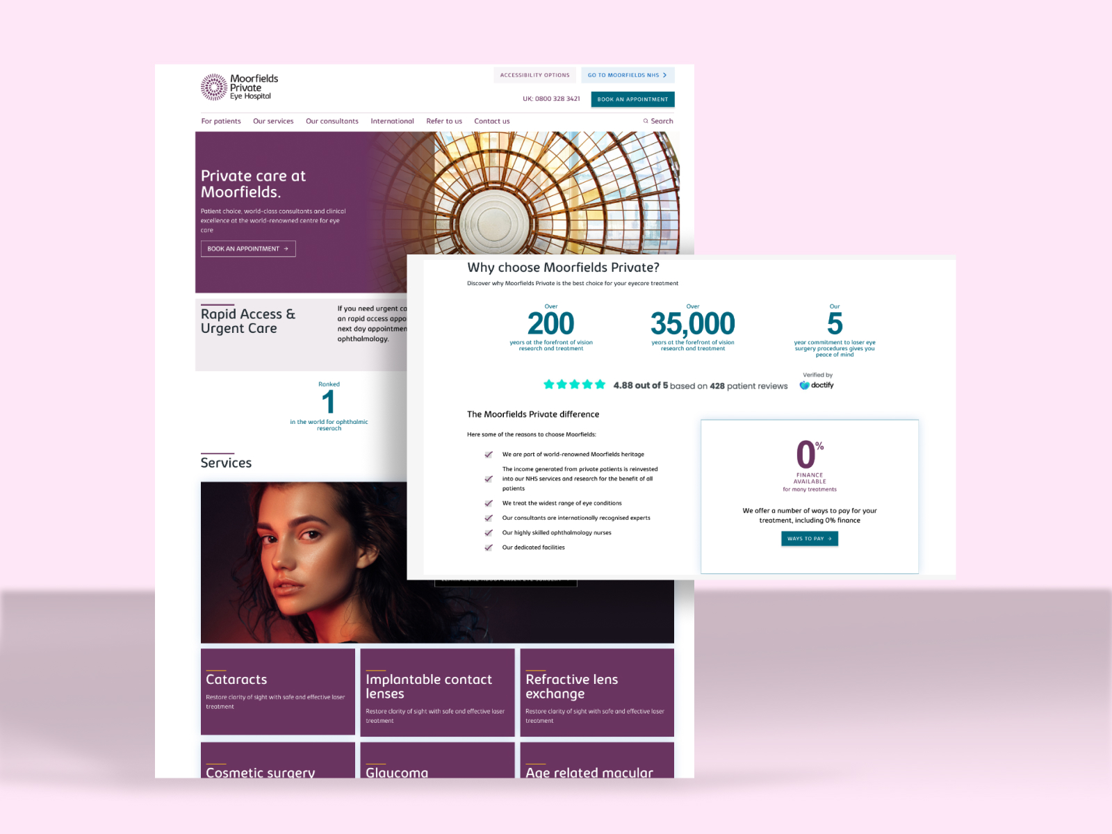
The Private Care website is designed to convert site visits to customer enquiries.
As the first phase in a multi-phase engagement with Moorfields, this project laid the foundations for a long term transformation of Moorfields' digital estate, to mirror many of the strategic objectives of both the Oriel project and the organisation.
The Oriel project, creating a leading-edge flagship centre near St. Pancras, will also restructures the organisation to integrate treatment, education and research into a combined facility. Having focused on the patient experience for the first stage, the next step of the digital transformation will need to focus on the needs of health professionals, researchers and students.
Thinking about the wider opportunity of eye treatment, the website and other digital channels have a much bigger role to play in the whole patient experience.
The private care side of Moorfields will also expand, both geographically into new countries, but also into new services. In future phases, patients will be able to pay for and manage their treatment online.
I am tremendously proud of the work done for Moorfields, and my role in pushing the project forwards to deliver a high quality solution. In striving to ensure that the new sites were, above all, focused on the needs of patients, it has made a meaningful difference to the user experience, and also established foundational UX and UI principles that can be built upon in future phases.