TL;DR — Redesigning the home energy customer sign-up process by putting the customer first.
Work completed while working at ENGIE, 2017-2019.
Joining Engie as a 'UX team of one', I was able to build influence and grow the strategic importance of design during the development of the Home Energy website and customer portal.
By bridging technical and product marketing teams, I built alignment towards a customer-centric solution to deliver more then a purely technical or operationally driven approach.
With limited support for user research and testing, I gained understanding of user needs from other sources, including customer support calls, screen recordings, analytics data, and QA testing.
Using these insights, I was able to redesign the new customer sign-up journey so that it was robust, Ofgem compliant, and with a completion rate of over 75%.
Although the free market for domestic energy was established in 2001, it was only from about 2014, with growing Internet usage and the advent of price comparison websites, that an increasing number of companies — both large and small — sought to gain a foothold to supply gas and electricity to UK households.
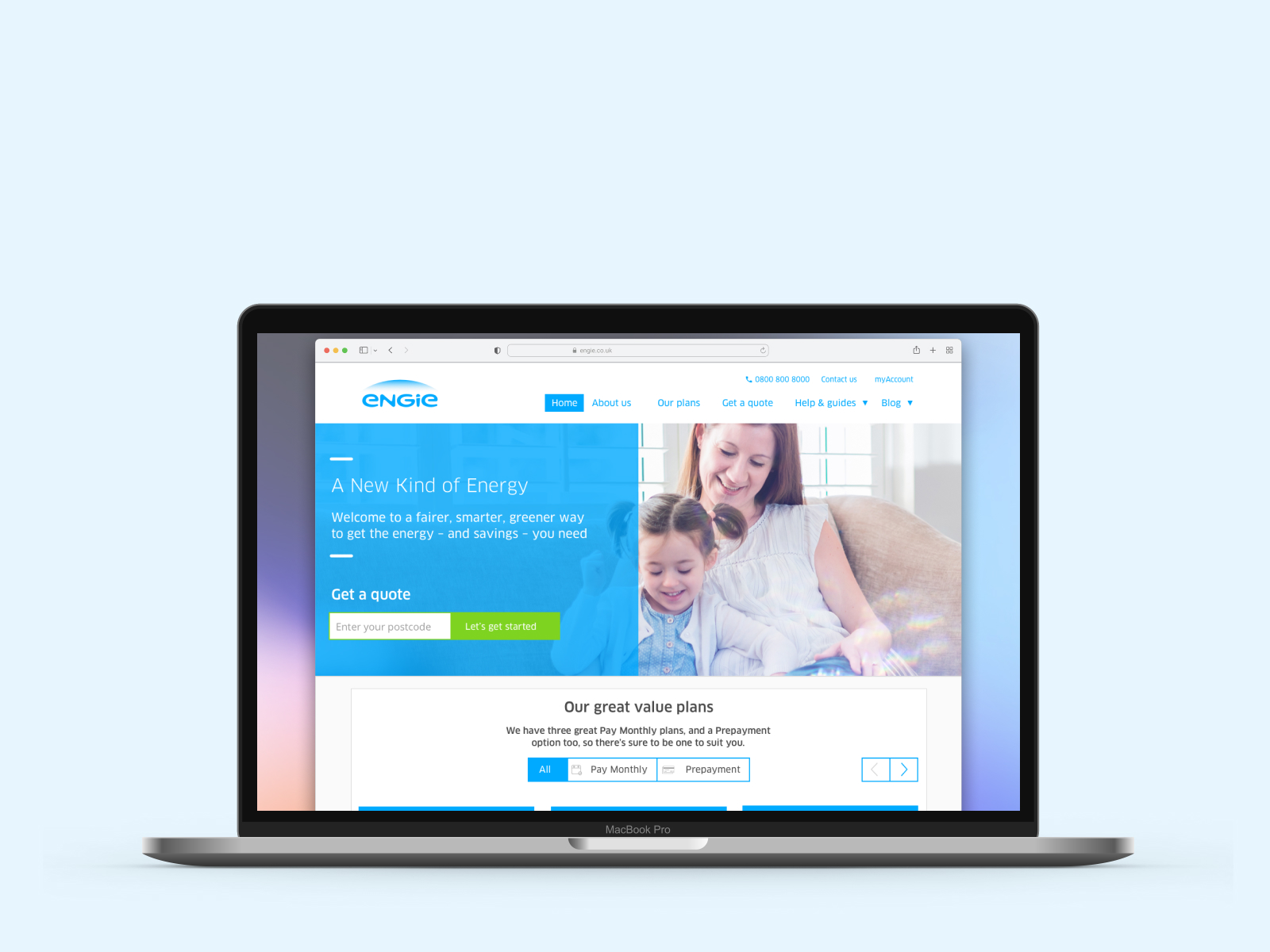
Engie, the French-owned multinational, already had a UK presence selling energy to business, as well as a range of facility management and other ancillary services. They entered the home energy market in 2017. As well as selling via price comparison websites, they launched a direct sign-up solution (internally known as the Customer Acquisition Portal) on the Engie UK Home Energy website. Designed by an external agency, it went live just after I joined, but it was clear almost immediately that it had serious flaws and would need to be rebuilt.
LESSONS LEARNED
Unresolved edge cases are a strong signal of unmet customer needs.
The existing Customer Acquisition Portal (CAP) was based on a concept of making it quick and easy for users to get a quote and then sign-up. The aim was to get it done in under 90 seconds — where this "need for speed" came from was never questioned.
In the desire to make the sign-up process super quick, there was:
Both of which were required for Ofgem compliance. So that was the major failing of the initial system.
Another failing was the address look-up functionality. Because it was not connected to the national database of meters, it resulted in large numbers of users not being able to complete their sign-up online.
Furthermore the system was ill-equipped to deal with any 'edge' cases such as customers with multiple accounts, different billing address to supply address etc. In the rush to create a quick sign-up experience the system failed to consider anyone outside a default customer profile.
LESSONS LEARNED
In small teams you have to be prepared to roll your sleeves up and pitch in.
My role on this project was as the design lead, working initially as a "UX team of one" in an agile Scrum team including a Product owner, BA, Front-end developers, Back-end developers and a QA tester.
Mapping out the range of work to do.
In addition I worked with the Customer Service Manager to collate customer feedback and identify pain points, and a Research Lead to understand customer needs and assist with usability testing.
I wrote some HTML code and CSS for components, and build the Sass files using the 7-1 pattern. This was a huge step-up for me in my web dev skills — I even learned how to use Git.
I also became the Google Analytics 'go-to guy' within the company, passing certification in Google Analytics and Tag Manager, and even running a series of workshops with staff to help them understand and interpret GA data.
The project was to redesign, rebuild and relaunch the CAP to make it compliant, reliable, and a better experience.
I wanted to make Engie's home energy product more customer-centred and guide users through the sign up process seamlessly. Rather than speed of sign-up, it was more important that we were gaining customers the right way and with a much higher completion rate. This would then allow the customer acquisition activity to scale as sales and marketing kicked in.
I also wanted to bring in regular qualitative user research to evaluate our work both during the build and to support ongoing optimisation, and support this with quantitative data and meaningful metrics gathered through Google Analytics.
LESSONS LEARNED
If you are a UX team of one, look for allies who can support you
"Unhappy customers are your greatest source of insight"
— Bill Gates
With no willingness for the company to undertake primary user research of the existing CAP, I had to be resourceful in trying to understand user needs. I found an ally in the Customer Service Manager and was able to review common customer frustrations from the Customer Support Centre, and even spent some time listening in on customer phone calls.
Another source of insight was to look at the data from Google Analytics, and although it was poorly set-up, it was sufficient to confirm some areas of weakness where customers were dropping off.
I also used Hotjar to record a number of user sessions, again identifying user frustrations in being able to complete the sign-up journey.
In my calculations only about 1 in 4 users were able to successfully complete the sign-up journey after selecting a tariff — due to a combination of poor UX and technical implementation.
Having developed an in-depth understanding of the problems with the user journeys with the pre-existing CAP, we were able to formulate a plan to redesign the end to end journey and reengineer the technical implementation.
I spent a huge amount of time on this activity, as it was fundamental to fixing the problems with the existing customer acquisition process, and key to understand the integration of APIs for: address look-up, meter look-up, tariff look-up, and billing system for user account look-up and record creation.
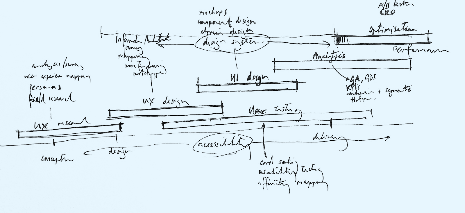
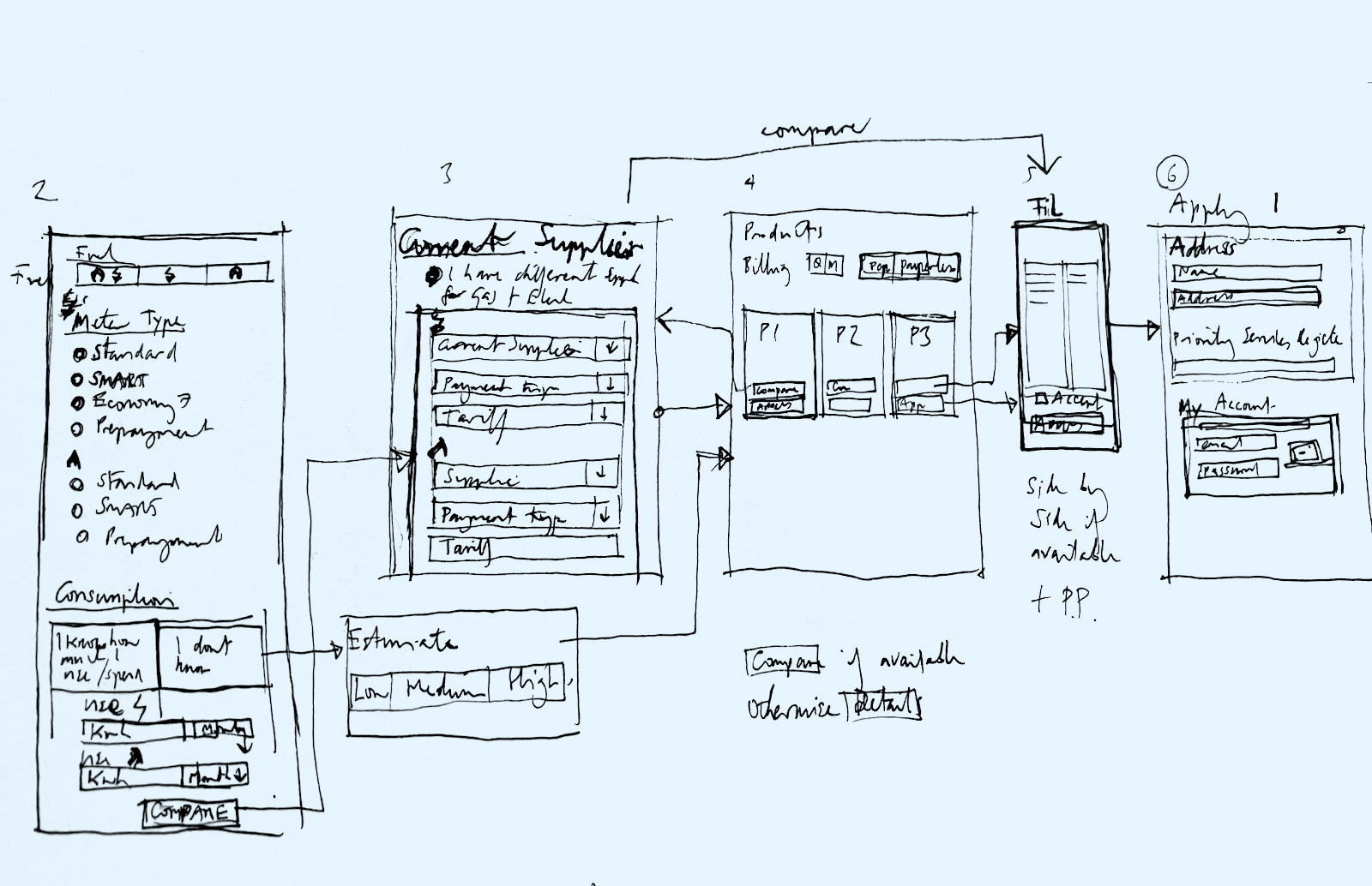
Much of this work was done collaboratively with the team, with whiteboard sessions and lots of sketching.
Considering options for the redesign.
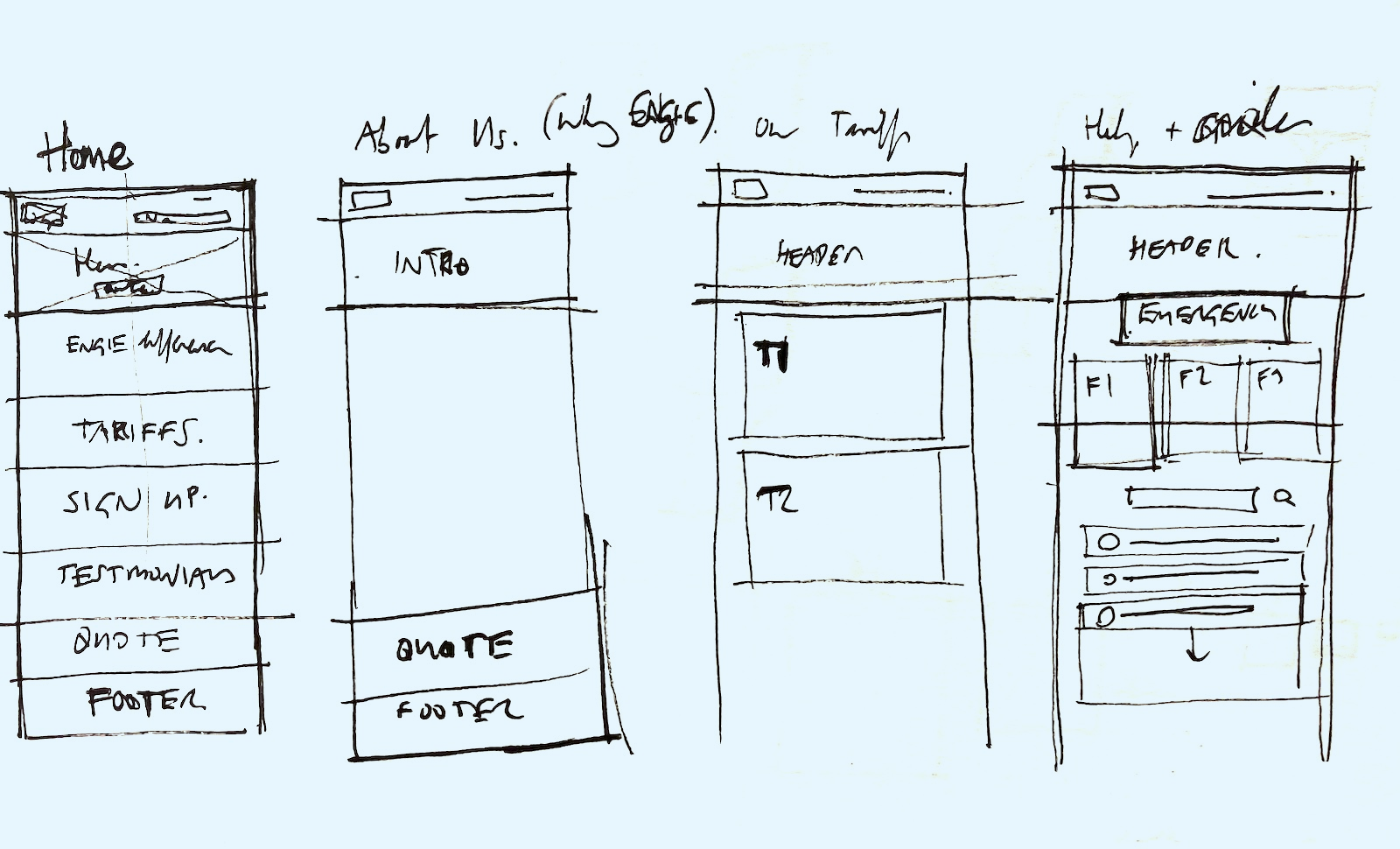
Page information hierarchy.
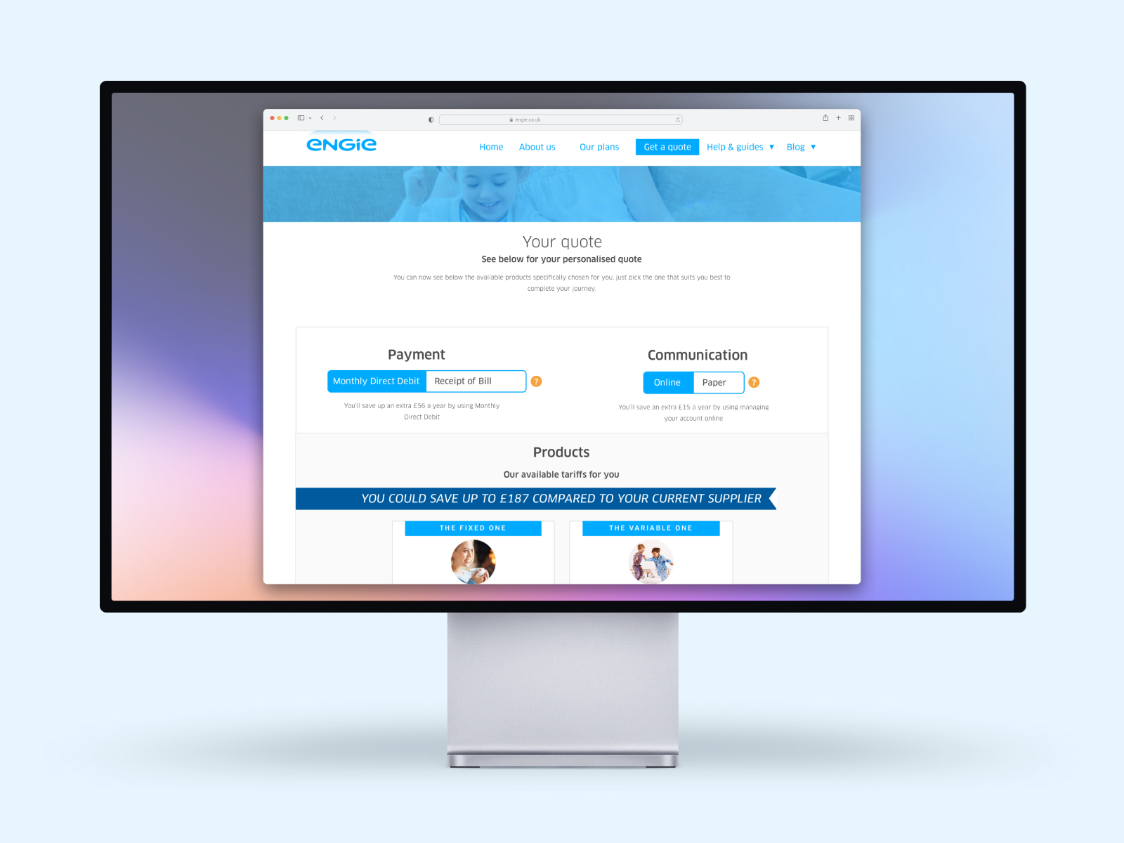
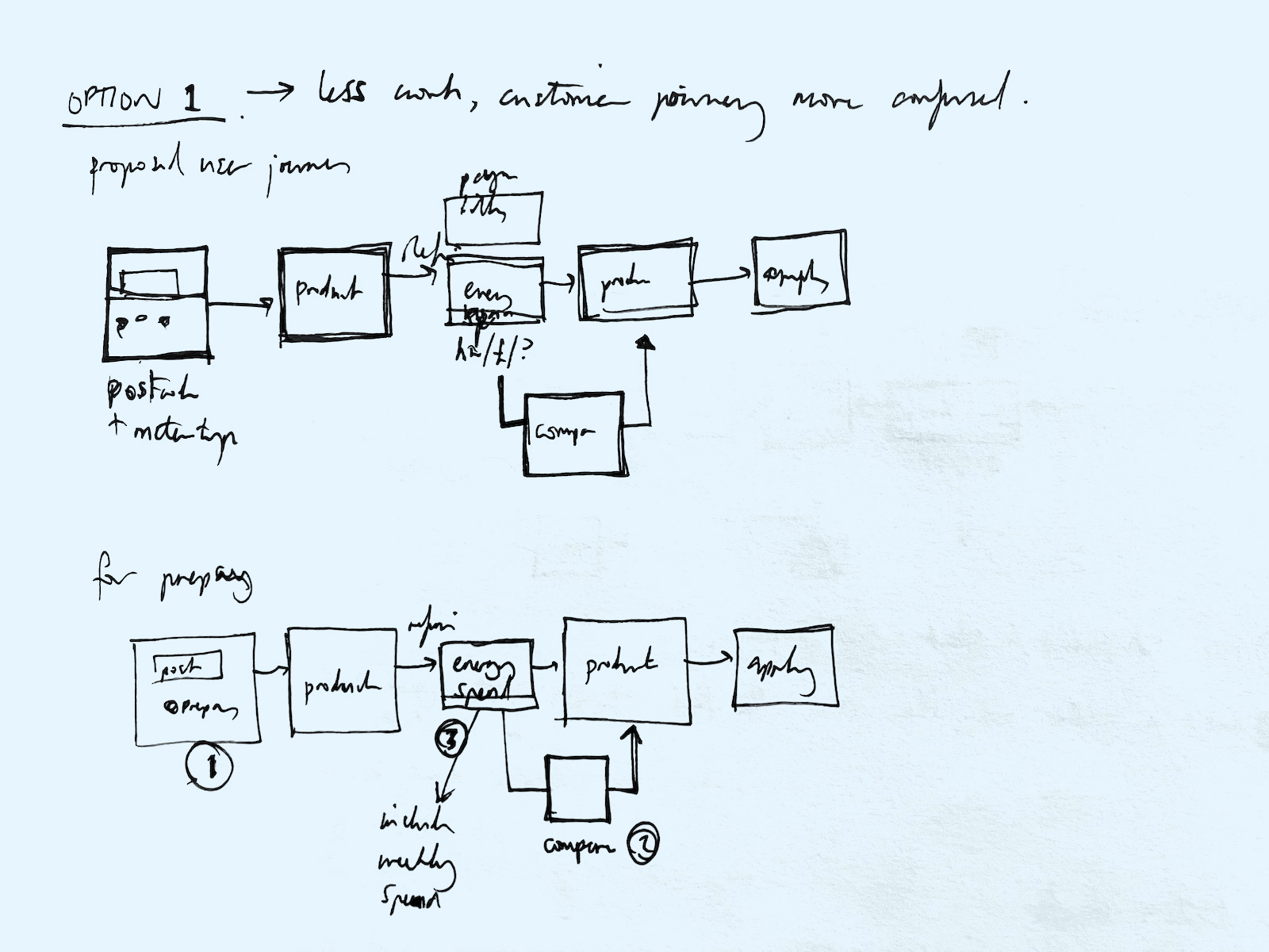
We split the journey into two main parts to create an Ofgem compliant sign-up experience.
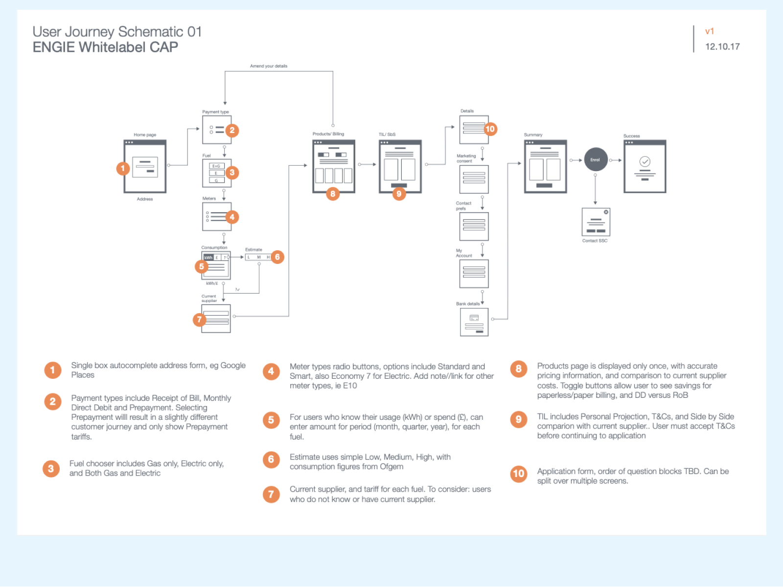
The redesigned customer acquisition flow broke down the two main forms into a series of smaller steps.
With multiple existing systems to integrate with, there was great potential for errors or unexpected results, eg no address returned or no meter data. These could potentially de-rail the online sign-up process, or require additional information.
Improving the comparison and calculation.
Add to this the options around tariffs, gas and electric options, pre-pay and other payment types (eg Economy 7), and there were a lot of considerations to juggle as part of the user journey. As well as testing exhaustively myself, I consulted with the QA testing team to map the routes and options which would lead to errors and incomplete sign-ups.
There were 6 broad customer types developed by the marketing team, based on their attitudes towards switching energy suppliers and what they looked for in a new supplier.
A key target group was "considerate customers" who wouldn't just switch to the cheapest tariff (ie "serial switchers") but instead valued customer service and clear communications, and were more likely to choose green energy tariffs. I thought long and hard about how these values could manifest themselves as part of the sign-up process — emphasising openness and clarity over quick conversion.
One way this was achieved was to offer customers more ways to compare pricing, by entering payment or usage information for their existing supplier. For users who did not know, or who were new to a property, I designed the journey to enable a more accurate estimate based on property size and occupancy.
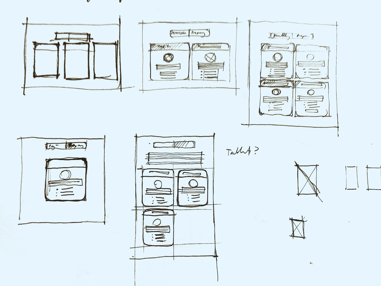
Sketching card designs for tariffs.
Once customers were ready to sign-up, I split the form into a number of smaller, more logical steps rather than one big form, which made it easier to deal with conditional branching and additional fields. It also made it easier to identify where users were dropping off in the sign-up journey.
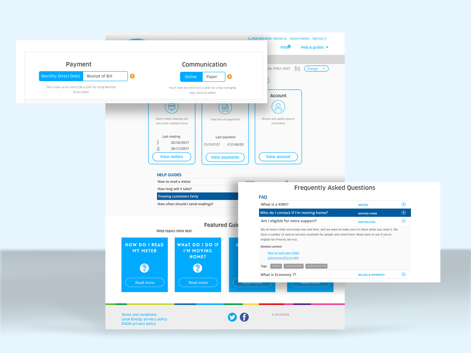
We added in-page contextual FAQs — based on knowledge of most common customer queries — to each step of the CAP.
I was finally given approval to conduct one round of user testing, but it came so late in the process it was little more than final checking before the new service went live. One of the key findings of the testing was that while users expected clearer communication around next steps on completion, with e-mail confirmation of their order, much like an e-commerce transaction.
My biggest challenge on this project was not embedding user research into the process, ultimately I failed to convince the business of the benefit early enough.

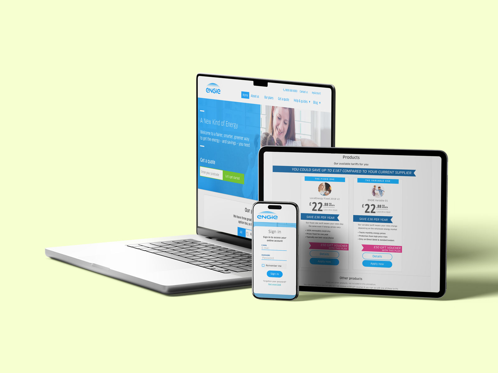
Finalised CAP screens with error messaging.
The new CAP went live in 2018, and with a much higher successful sign-up completion rate (at around 76%), customer numbers increased rapidly from 28,000 at time of relaunch to over 70,000. At this point the brakes were applied by the business and marketing ceased, due to further concerns over compliance in back end customer data handling policies.
CAP designs with contextual FAQs
I implemented GTM and goal tracking to track conversions and monitor the funnel, and together with the findings from research planned a series of optimisations.
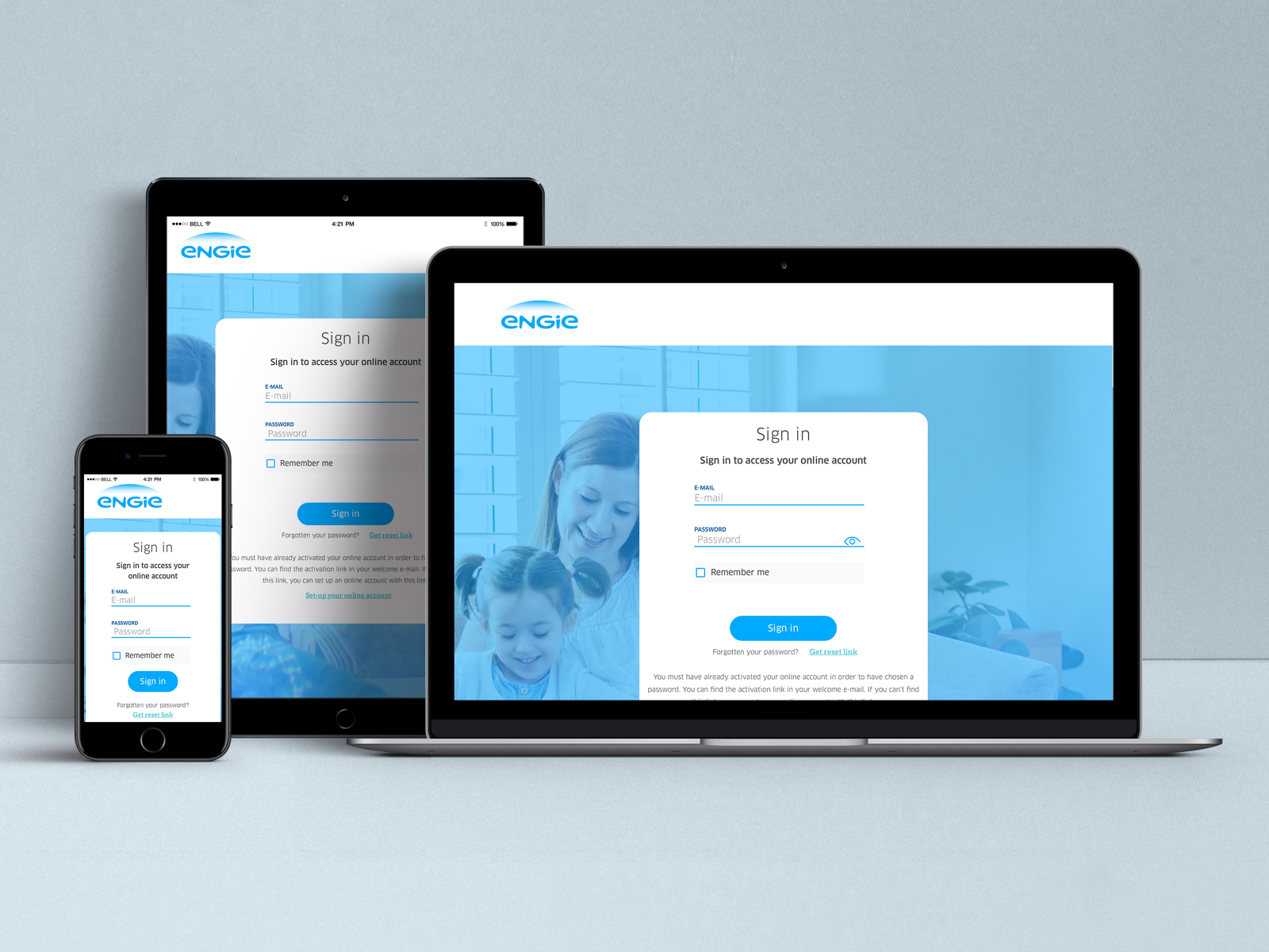
Subsequent activity for Engie Home Energy included developing a Customer Service Portal (CSP) to allow customers to manage their account, and added additional functionality including MIMO (Move-in, move-out), Renewals, Priority Services Register, Switching incentives, and multi-account customers.
I was also involved in developing an app version of the Customer Portal, and a white-label solution that could be sold to councils as part of Engie's wider 'energy and services' offering.
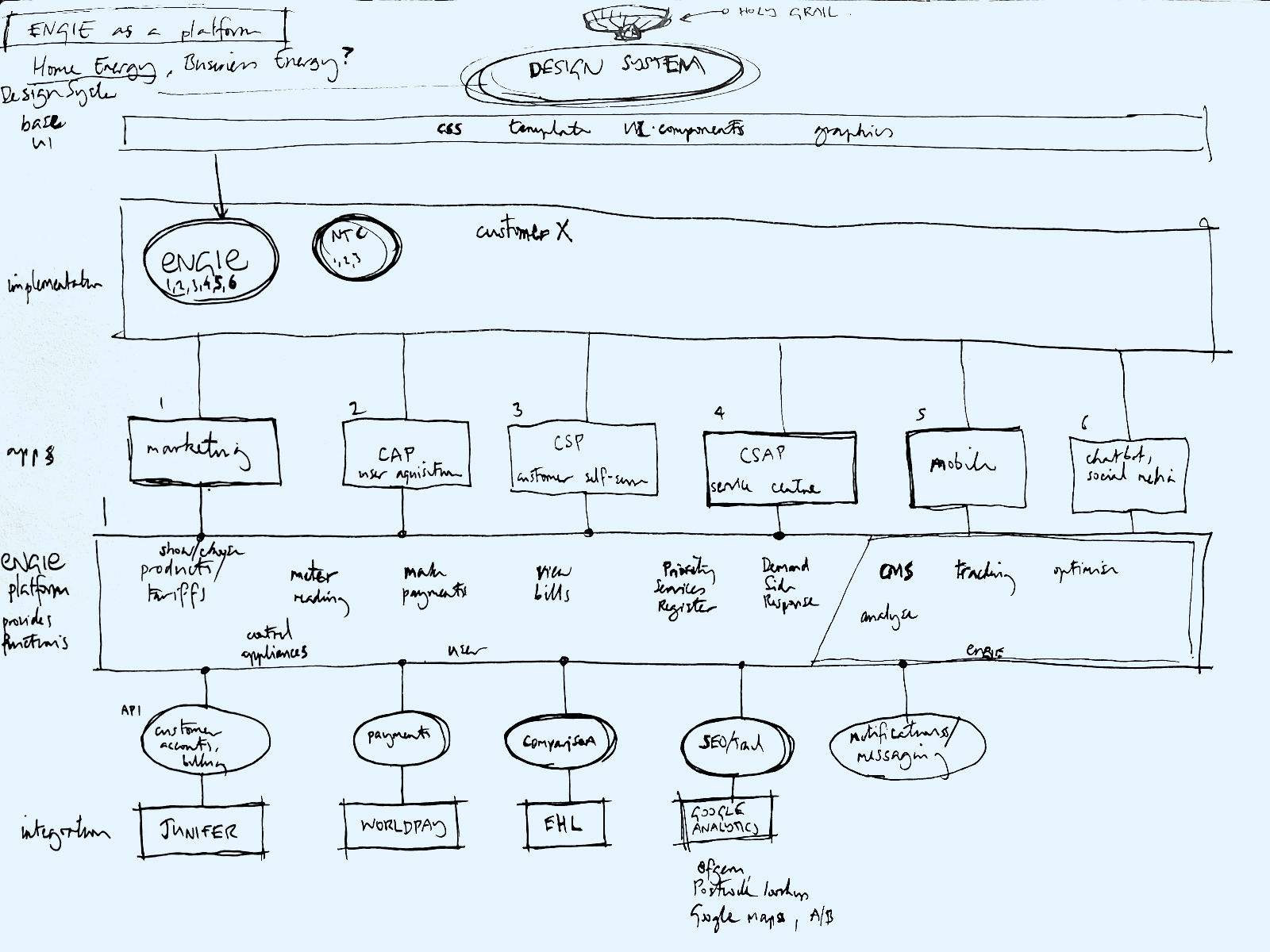
Sketch of Engie as a platform
With all of the additional products and services being developed, Engie's digital ecosystem was starting to expand rapidly, and I realised there was a need to work smarter to create a design system that would allow us to develop a shared visual language and manage code and components across multiple products.
There is a saying that 'every company is now a software company', and that certainly felt true at Engie, in its digital transformation journey. I envisaged Engie developing a platform of services and integrations which could deliver across multiple touch-points and brands, and extend into additional products.
Ultimately, changes in the market spelled the end of Engie's Home Energy offering — by this time I'd already moved on.
Razor-thin margins and long fixed-term contracts meant that many energy companies were left with mounting loses as gas and electricity prices rose on the global marketplace. Over 50 companies went under and many others exited the market and sold their customer base to another provider.
Engie's Home Energy was closed in 2020, and their remaining 70,000 customers acquired by Octopus Energy — who have gone on to effectively build the digital energy platform I described above.
"Requirements are just assumptions you are asked not to challenge" - Anon
There was so much I learned at Engie: my first experience of enterprise level design and development, being part of an agile team, and working client‑side rather than agency‑side.
Being embedded on one project for a long time gave me a chance to fully immerse myself in crafting the best experience possible. But the lack of support for user research meant looking for signals rather than direct observation and engagement with customers.
Ultimately I was able to build influence through evidence, help evangelise a customer-centred approach, and fight for user testing. But having more evidence earlier may have enabled me to challenge some of the initial requirements, rather than following competitors' approach.
It takes confidence and conviction to zig when everyone else is zagging, and that requires deep understanding of user needs.
The home energy market of 2017 was a very different place to where it is now, with current spiralling energy costs, and many companies either going out of business or exiting. This makes this case study perhaps hard to relate to — though with hindsight it is possible to see that many of the signs were there.
However, as a design project, I am still proud of the work I did to make a better experience for new customers signing up, within what was both a highly competitive and also a highly regulated market. Those two forces often made it hard to hear the voice of customer, but ultimately it was a customer-centric approach that briefly made Engie stand out from the competition.